And now from the GNOME edition.
If your computer meets the minimum (hardware) requirements to run all the features of GNOME 3, the default desktop will be GNOME 3. However, if it does not, it will run in fallback mode. The logic of GNOME 3 is one of those things that does not make sense to me. I know some people feel it is one of the best available, but it feels more like a step or two backwards in desktop computing, than an advancement. Ok, may be not backwards, but in the wrong direction. But that is just my opinion. Back to the screenshots.
Default view of GNOME 3 desktop. I call it the empty desktop.

Entries in the Office application category. LibreOffice 3.4.2 is the installed office suite.

Firefox 6 is the installed version of Mozilla Firefox.

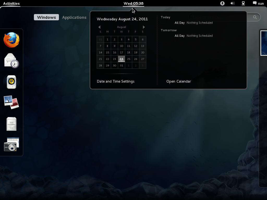
Shot of the desktop showing the calendar.

That is it folks. By the time the beta editions are released, we will start looking at more important aspects of the distribution.


Also, I assume that the main reason you dislike GNOME 3 can be gotten from two major factors: immaturity in the interface itself and it being a radically different approach to the standard desktop metaphor. It took me a bit of time to wrap my head around how to use GNOME 3, but now it works very well for me and I feel that it’s the most polished desktop I’ve used so far. Instead of simply doing your standard desktop setup, they really tried to improve on it and, for me, it works very well. As far as immaturity goes, GNOME 2 has been around for a REALLY long time, and when it was first released almost everybody seemed to dislike it. In contrast, GNOME 3 has only been here for about four (almost five) months. I’m certain that GNOME 3 will only get better as time goes on. Until then, you might want to try re-thinking the way you use the desktop with GNOME 3 and try starting from scratch. It really made a difference for me and many of the GNOME developers/designers.
where is gnome3 screenshot
i hope no problem to try kde prallel to gnome3 as it was .. because i want try Gnome3 and not resign of KDE which i like much more than W7/OSx. Is it true that Gnome3 is better integrated to Fedora16 than KDE ?
Fedora has a KDE Spin, so I do not know what you mean by “better integrated.”
See a review of Fedora 15 KDE at http://www.linuxbsdos.com/2011/06/25/fedora-15-kde-review/
pleaase remove the link in my answer – has nothing to do with
🙁
Gnome-Shell, what to think about?
First of all, give it a try, but not just a try of some hours, but of some days, a week – and you will definately change opinion
You will notice, it;s the most intelligent, the most intuitive and the most time saving desktop you have ever used
I am using linux nox since … 15 years. Aside of linux i was using windows (beginning with 3.1), Mac OS (since OS7), and some systems people do not even remember
Gnome shell is surely a new approach – minimalistic, really optimized for keyboard user (mouse user will like the “design” – that even my brother – a “hardcore” mac user called “clean”(, but keyboard user eill really rapidly adopt it
To open any program – let’s take gedit – you do not need to go in the left corner, then on the right side for accessories, then choose gedit
That takes time – i admit. But click on the super (windows) key , type “ge” (without””) – and enter – and you have already opened the program .
If you take the time to understand their interface, you will notice that some very clever people were thinking about, how to make life easier
Just 1 thing not to forget: in standart gnome-shell, some functions are missing – the gnome extensions – and gnome-tweak-tool help to forget these “missings”
PS; one last tip: install the Zukitwo theme for gtk2/3 & gnome-shell – you will like it
Gnome3 keyboard wise? not user wise that’s for sure.
open your gedit?, on Gnome2, xfce, lxde, etc. Alt+F2 (enter any name). Can’t be more simple. who needs menus?
Gnome ‘old’ was ugly and not smooth.
But ‘they’ made later sort of an KDE 3.5 thing of it and that is what people like (when it looks good and it did after a while).
Gnome 3 is simply too early. Wait, test and build for some years and don’t annoy the user. Make it better then Gnome 2.3 and if you like to annoy the user keep it switchable with the old Gnome. Don’t dictate!
In the meantime I use old Gnome, or KDE 4, or KDE 4 with Xfce, or Xfce, or Lxde (very nice and light and fast; with a look almost like Gnome; and you can run almost everything on it; also KDE apps like Akragator, Kmail or… name it). So no problems here.
GNOME 3 looks pretty much the same as before. I can’t wait to see what other major changes will be in before release!
Also, I assume that the main reason you dislike GNOME 3 can be gotten from two major factors: immaturity in the interface itself and it being a radically different approach to the standard desktop metaphor. It took me a bit of time to wrap my head around how to use GNOME 3, but now it works very well for me and I feel that it’s the most polished desktop I’ve used so far. Instead of simply doing your standard desktop setup, they really tried to improve on it and, for me, it works very well. As far as immaturity goes, GNOME 2 has been around for a REALLY long time, and when it was first released almost everybody seemed to dislike it. In contrast, GNOME 3 has only been here for about four (almost five) months. I’m certain that GNOME 3 will only get better as time goes on. Until then, you might want to try re-thinking the way you use the desktop with GNOME 3 and try starting from scratch. It really made a difference for me and many of the GNOME developers/designers.