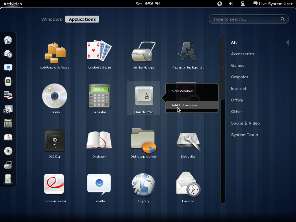
The desktop search feature works like the Search and Launch feature of KDE 4 Netbook desktop interface. Start typing into the search box, and the system begins to return results from the local content. Want to search the Web instead? You may search the same string on Wikipedia or Google by clicking on the appropriate button. The search results will open in a window or tab of the default browser.

This is Nautilus, the file manager, running in Fallback Mode.

And this is Nautilus on GNOME 3. The main difference you will observe right away is the absence of the Minimize and Maximize buttons. The developers say there is no need for a Minimize button because there is nowhere to minimize to – there is no bottom panel in Standard GNOME 3. And the Maximize button? Because of the “Snapping” feature, that, too, is not needed. To snap a window, you click and hold the titlebar and drag it to the top edge of the desktop. That will maximize it. Clicking on the titlebar and dragging it away from the top edge will reduce it to its original size. For what its supposed to accomplish, I think “Snapping” is too much work. It is a cool feature, but the old Maximize button is much better. Even with Snapping, I think there is a place for a Maximize button.

Here’s a shot of the desktop showing a useful side of Snapping. With two small windows open, click and drag one on its titlebar and snap it to the right edge of the desktop. Repeat the operation on the other window, but this type, snap it to the left edge of the desktop.

All the management applications that used to be accessible in GNOME 2 from the System > Preferences menu are now in System Settings, which looks just like KDE’s control center. Clicking on an application opens it in place, and you can return to this window by clicking on All Settings. This, I think, is better than the arrangement on GNOME 2.

Take the Time and Date management application for example. It should look very familiar. After viewing it or making any changes here, clicking on All Settings will take you back to the main System Settings window.

The Users and Groups management utility also should look very familiar. Automatic login now can be “turned” On and Off. It is On by default in this test Fedora image, but should Off when Fedora 15 is released sometime in late May or early June.

Changing a user account password now has a password hint field, a feature not available on the same application in GNOME 2.

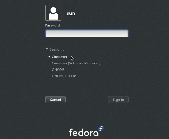
Overall, GNOME 3 feels and looks better than GNOME 2. The main complaint I have is that in full GNOME 3 mode, the desktop seems to get in the way; using the desktop feels more like work. In the coming months, I suspect that many users will opt to run in Fallback Mode instead of in Standard mode. Luckily the system allows you to switch modes. That, however, requires logging out and then logging back in.
Resources: Want to try GNOME 3 before your distribution makes it available? Grab a test image here. While you are doing that, take a second or two to subscribe to this website via RSS or email. Future articles will then be delivered to your feed reader or Inbox automatically.


Hi, thanks for the review!
I’m wondering if I can install it on my pc, on old AMD Athlon, 1,2 Ghz with only 262 RAM..
It has a WinTVExpress PAL/SECAM tuner (44806), and that’s almost the only thing I really need to have working… Do you think I can have drivers and WinTV working if I install Gnome 3?
Many thanks!
I am Windows 7 user who is willing to switch to a Linux distro. I tried Ubuntu 10 and Linux Mint 11 and like them. Now, as I finally decided to make the full switch, all the main distros are using crap shells. And of course, I don’t want to install a distro with which I will be stuck in the future. So now the decision is very hard for me. Looking for an alternative to the Unity and Gnome 3 garbage. Unity isn’t that bad, I have to say. But after trying the live cd for 2 weeks, too many things got into my way for the simplest tasks. So I tried a Gnome 3 desktop, but it’s even worse — just on another level. Gnome 3 is the stupidest thing I ever tried so far. Ubuntu and Mint went down the hill with their decision to implement these garbage shells. I am currently trying openSUSE with KDE desktop. This seems the only alternative that’s left. Too bad that exactly Linux developers do everything wrong that MS did wrong in the past.
Yep, KDE is the way to go.
I install openSUSE 12.1 in Virtualbox and i still can’t make the GNOME 3 GUI work. Still fallback mode. 🙁
I recently switched to ubuntu 11.04 and wanted to give unity a try, it felt unresponsive at first but I got the hang of it in 2 to 3 days and started to work my way well through all the complications, I have been reading about gnome 3 shell and how its better than unity so I decided to install it to replace unity and after it it was done I immediately noticed my desktop felt lonely, it felt like I was staring into a wallpaper and not my desktop, im just not one of those people who like a clean desktop, i missed the unity bar immediately, the no minimize button is also confusing in gnome, to me unity maintains some of the old features while bringing in a lot of new ones at the same time and it seems to me like a nice change, im sure unity will develop over time and it will surely stand out
gnome 3 is way better than unity. ubuntu will fail for not giving users what they want
Gnome (s)hell is a horrible mess. It’s slow, unusable and just plain ugly.
I just hate the new GNOME 3, they totally messed it up, almost as bad as Unity. All this has for the first time made me look at alternatives and so far I’m positively surprised with KDE. I’m starting to like kDE so much that I’m currently trying out various KDE distributions so I can see which one is the best for replacing Ubuntu later.
Support for older, less powerful computers is a concern that I have with Gnome 3. First of all I read that they will be working to make the graphic requirements lower for the main version. I have not read, but I believe, that they will put some more time into the fallback version, and make it work more like the main version.
GNOME 3 is super-fast and stable. I have the (subjective) feeling that the virtual desktops and the lack of visible application notifiers make it easier to concentrate on the task at hand; you work on one desktop and just forget about the others. Until an incoming mail or something else asks for your attention by sliding in from the bottom of the screen.
It looks awful and Gnome Shell makes things harder than they used to be. An only thing which looks better is desktop. Applications remained the same. Same ugly icons, ugly theme. Sadly, Gnome Shell is slow and unstable. However, what’s the most irritating is lack of basic features which are important on every usable desktop. There’s no way to change fonts till someone installs third party hack tool. Launching and managing applications became harder too.
Hi, I have been using Gnome3 on Opensuse from last 3 days and it simply rocks (better than unity). It does add subtle usability to your daily tasks which one doesn’t realize immediately.Its certainly better than Gnome2 and I hope any minor kinks will be ironed out soon.