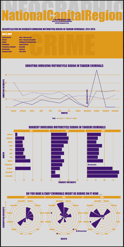
For R fans and infographics lovers out there (I’m one of you), here’s an article that shows how to layout and design an infographic in R.
Here’s how the data used to generate it was obtained.
y1 <- round(rnorm(n = 36, mean = 7, sd = 2)) # Simulate data from normal distribution
y2 <- round(rnorm(n = 36, mean = 21, sd = 6))
y3 <- round(rnorm(n = 36, mean = 50, sd = 8))
x <- rep(LETTERS[1:12], 3)
grp <- rep(c("Grp 1", "Grp 2", "Grp 3"), each = 12)
dat <- data.frame(grp, x, y1, y2, y3)
Below is the final product. Go here to learn how the author did it.


