The first alpha of Fedora 16 was released yesterday (August 23, 2011). As you might expect, this is buggy, really buggy. While bug hunting is in progress, here are a few screenshots from the KDE and GNOME editions. A few of them have already been posted here, but the rest are new.
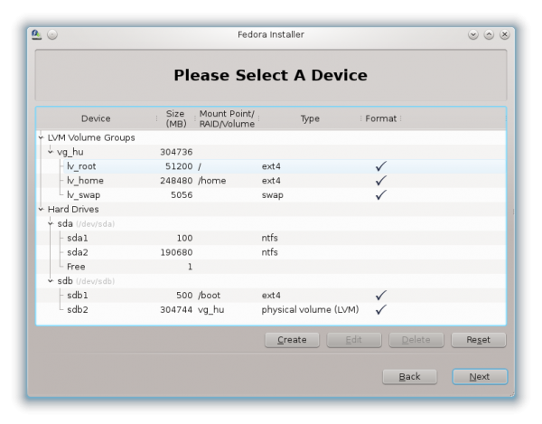
In that article, I showed, via a couple of the screenshots, that Anaconda, the Fedora installer, will be using the GPT partition table by default. There were some doubts about that, but the images in this article confirms it. GPT partition table will be the default, when Fedora 16 is finally released, which will be in early November (2011).
GPT, the GUID Partition Table, is an alternate disk partition table scheme that solves two problems associated with the MBR (Master boot Record) partition table: It allows the configuration of more than four primary partitions, the maximum supported by MBR, and also supports disk partitions of more than 2 TB.
From the test installations I carried out, I observed that GPT is the default if Fedora is installed in standalone mode. If, however, there is an existing distribution or another operating system on the drive, and you attempt to dual-boot, it defaults to the MBR partition table.
On the disk partitioning methods step of Anaconda, the methods are still the same. The only new addition here is the “Use LVM” option. LVM, the Linux Logical Volume Manager, has been the default disk partitioning scheme on Fedora for some time. It will still be the default on Fedora 16, but this option makes it easy to use a non-LVM partitioning scheme, and still have Anaconda create partitions automatically for you. On previous versions of Anaconda, if you opt to use a non-LVM partitioning scheme, you had to create partitions manually.

These are the partitions created when LVM is in use. What this shows, is that the default partition table will be GPT, rather than MBR-based. But as stated earlier, this is the case if Fedora is the only distribution that is going to be installed on the disk.

If you opt to not use LVM, the image below shows the partitions that the installer will create. Five partitions, all of them primary, thanks to GPT.

Fedora 16 will mark the first use of GRUB 2 as the boot loader in Fedora. Fedora 15 and earlier used GRUB Legacy. Also shown in this image is the new kernel version.

Ok, enough about the installer, let see a few desktop screenshots.
First from the KDE edition, which is powered by KDE 4.7.
The default wallpaper, which is the same across all the Fedora 16 editions, is very visually appealing. The guys responsible for this are true professionals.

The desktop showing a system message from the notification area. The message reveals just one of the many bugs that will be reported.

Default desktop with the Kickoff menu, the default menu style.

Main interface of the KDE Plasma Netbook interface.

Entries in the Office category. KOffice is the installed office suite. This screenshot, from the KDE Plasma Netbook interface, shows the components of this integrated office suite for the K Desktop Environment.


Also, I assume that the main reason you dislike GNOME 3 can be gotten from two major factors: immaturity in the interface itself and it being a radically different approach to the standard desktop metaphor. It took me a bit of time to wrap my head around how to use GNOME 3, but now it works very well for me and I feel that it’s the most polished desktop I’ve used so far. Instead of simply doing your standard desktop setup, they really tried to improve on it and, for me, it works very well. As far as immaturity goes, GNOME 2 has been around for a REALLY long time, and when it was first released almost everybody seemed to dislike it. In contrast, GNOME 3 has only been here for about four (almost five) months. I’m certain that GNOME 3 will only get better as time goes on. Until then, you might want to try re-thinking the way you use the desktop with GNOME 3 and try starting from scratch. It really made a difference for me and many of the GNOME developers/designers.
where is gnome3 screenshot
i hope no problem to try kde prallel to gnome3 as it was .. because i want try Gnome3 and not resign of KDE which i like much more than W7/OSx. Is it true that Gnome3 is better integrated to Fedora16 than KDE ?
Fedora has a KDE Spin, so I do not know what you mean by “better integrated.”
See a review of Fedora 15 KDE at http://www.linuxbsdos.com/2011/06/25/fedora-15-kde-review/
pleaase remove the link in my answer – has nothing to do with
🙁
Gnome-Shell, what to think about?
First of all, give it a try, but not just a try of some hours, but of some days, a week – and you will definately change opinion
You will notice, it;s the most intelligent, the most intuitive and the most time saving desktop you have ever used
I am using linux nox since … 15 years. Aside of linux i was using windows (beginning with 3.1), Mac OS (since OS7), and some systems people do not even remember
Gnome shell is surely a new approach – minimalistic, really optimized for keyboard user (mouse user will like the “design” – that even my brother – a “hardcore” mac user called “clean”(, but keyboard user eill really rapidly adopt it
To open any program – let’s take gedit – you do not need to go in the left corner, then on the right side for accessories, then choose gedit
That takes time – i admit. But click on the super (windows) key , type “ge” (without””) – and enter – and you have already opened the program .
If you take the time to understand their interface, you will notice that some very clever people were thinking about, how to make life easier
Just 1 thing not to forget: in standart gnome-shell, some functions are missing – the gnome extensions – and gnome-tweak-tool help to forget these “missings”
PS; one last tip: install the Zukitwo theme for gtk2/3 & gnome-shell – you will like it
Gnome3 keyboard wise? not user wise that’s for sure.
open your gedit?, on Gnome2, xfce, lxde, etc. Alt+F2 (enter any name). Can’t be more simple. who needs menus?
Gnome ‘old’ was ugly and not smooth.
But ‘they’ made later sort of an KDE 3.5 thing of it and that is what people like (when it looks good and it did after a while).
Gnome 3 is simply too early. Wait, test and build for some years and don’t annoy the user. Make it better then Gnome 2.3 and if you like to annoy the user keep it switchable with the old Gnome. Don’t dictate!
In the meantime I use old Gnome, or KDE 4, or KDE 4 with Xfce, or Xfce, or Lxde (very nice and light and fast; with a look almost like Gnome; and you can run almost everything on it; also KDE apps like Akragator, Kmail or… name it). So no problems here.
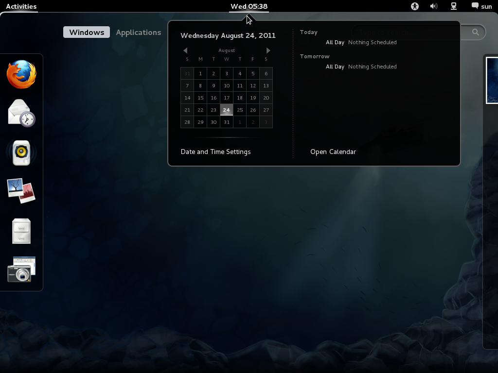
GNOME 3 looks pretty much the same as before. I can’t wait to see what other major changes will be in before release!
Also, I assume that the main reason you dislike GNOME 3 can be gotten from two major factors: immaturity in the interface itself and it being a radically different approach to the standard desktop metaphor. It took me a bit of time to wrap my head around how to use GNOME 3, but now it works very well for me and I feel that it’s the most polished desktop I’ve used so far. Instead of simply doing your standard desktop setup, they really tried to improve on it and, for me, it works very well. As far as immaturity goes, GNOME 2 has been around for a REALLY long time, and when it was first released almost everybody seemed to dislike it. In contrast, GNOME 3 has only been here for about four (almost five) months. I’m certain that GNOME 3 will only get better as time goes on. Until then, you might want to try re-thinking the way you use the desktop with GNOME 3 and try starting from scratch. It really made a difference for me and many of the GNOME developers/designers.