Anaconda, the Fedora system installation program, is one of the best available on any distribution – Linux or BSD. It has its faults, but in general, it has more features than any I have used. At least for me, it offers all the features that I need, plus it is very easy to use.
Its interface is very intuitive, and each step is easy enough to understand, if not self-explanatory. But come Fedora 18, the next stable edition of Fedora, Anaconda will feature a whole new look. It will be a complete overhaul of the user interface. I have seen it, and I must confess that I am not very impressed. I am not referring to the backend, just the look and feel and ease of use.
The official rationale for the new design is that the current “graphical UI is really starting to show its age, both to the users and to the developers. Adding new features (especially for new storage technologies) is difficult, and there’s no apparent overall design to the user experience.” From a purely end-user perspective, I disagree with the “there’s no apparent overall design to the user experience,” because the current UI offers a far more coherent user-experience than this new one.
But that is just me. When it comes to graphical user interfaces, I like them simple and intuitive to use. To be sure, the version of Anaconda that will ship with Fedora 18 is still alpha software, but most of the work appears to have been completed. All that remains is edge-smoothing.
If you have not downloaded and installed a pre-release version of Fedora 18, these screen shots will give you an idea of what the new Anaconda looks like.
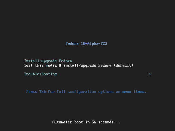
One step before Anaconda starts, this is the boot menu, which is still the same as the current boot menu.

And this is the language settings step. As in most installation programs, you should not have to do anything here but click Continue. By the way, why are the Continue and Quit buttons in different time zones?

This is the main interface, and where you will really notice a sharp break from the current Anaconda. It is like a rendezvous, where you will always return after making changes to any part of the installer. In most cases, the only parts that will need to be configured are Software Selection (Software), Network Configuration (Software), and Installation Destination (Storage). I do not have any problem with this window. It is the Storage part, where disk partitioning will take place, that will take some getting used to.

This is the Date & Time configuration step.

If you choose to configure NTP (Network Time Protocol), you will be presented with this window.

This is the keyboard layout step.

In the current Anaconda, network interface configuration is automatic, and it still is in the new version, but you will be able to configure this step manually, just as you do on a running system.

At the installation source window, you will be able to choose local or network source of installation.

Your options for network installation are shown here.


The previous Anaconda is going to be around for a while. Because of new hardware, forcing uefi booting, a new Anaconda is required.
The weakness with the old one was the difficulty of allocating partitions across different disks.
For example, /boot on one drive, /home on a second /opt on a third and everything else (/ /etc /usr etc) on a fourth.
I was hoping that anaconda would be ready for Fedora 18, but it will be late. Still, it will be more “first time user” friendly.
I have been using anaconda for the past 6 years, and this new version is a major improvement. I long ago suggested that a GUI interface that incorporates a Gparted presentation of disks and partitions, would go a long way to eliminating installation errors, where there are multiple partitions on a single drive.
I would like to address some of the English text. It could be improved, and I offered via Fedora user group to do it, but I have not ever had any feedback. How do I go about getting myself involved in rephrasing some of the text?
There is one default button missing, from what I saw of the print-screens, and that is “Use default Settings”. There may be a resequencing of some panels, but that is to be expected. It is a great step forward. Bravo to the developer(s).
But the current presentation of disks and disk partitions in Anaconda is as good as it gets. It’s very easy to explain to anybody, even to a noob. Why did they have to change that aspect if it’s not broken?
As far as I am concerned, as long as the actual distro works then who CARES how the install GUI looks? I come from a MS background, and although MS managed to make their installations all “pretty” and enticing for the eyes, the actual “insides” of the OS just plain sucked! I’d rather a screwy, not-too-familiar, installation interface that “leads” to software and technology that WORKS, than to have something look good for the hour – half hour it takes to install and then have to deal with an OS that is useless! SO lighten up maybe?….there’s worse things to deal with when installing software..(incompatible HW……faulty files etc….
yeah, the software selection does look overcomplicated. Though usually I install the “add-ons” after and not during the OS installation, since I install software packages on an as needed basis.
now that the alpha version is out, the new anaconda interface looks pretty good.
You’ve got to be kidding! Have you tried setting up a dual-boot system, or creating partitions manually. How does it stack up wrt the current stable version?
the software selection on the pre-alpha that was “too detailed” was probably just to test the interface on much simpler tasks (such as seeing if it actually installs a single software package) before testing more complicated ones such as the entire set of administrator tools in one add-on, and was obviously not the final since the add-on selection on the alpha version is better laid out than the one on the pre-alpha version. I’m currently testing dual-booting now, but I don’t expect it to work flawlessly since this is the alpha version, the installer has already crashed several times, which is not surprising from an alpha release. Anaconda will probably work flawlessly on the final release.
It looks very ubuntu-ish but its nice to see they are making changes
Ubuntu is not the only distribution that has a following. Installation was and is a major weakness in attracting new converts from Windows to Linux. Anaconda goes much much better than before to address this barrier for new users.
What I see in the interface so are good points and bad ones, but I’m afraid I have to distance myself from the posts of Christopher Thomas and Finid. Their posts address only futilities as far as GUI design goes, and should be put near the bottom of the priority list.
Why so? Well, first lets remind ourselves what the objective of a GUI is. It’s not (as some people seem to think) to provide eye candy. Eye candy is a waste of time (unless you can use it to sell something).
The objective of a GUI is to allow an end-user to use a piece of software safely, effectively, conveniently and reliably with (almost) zero knowledge of how it works (and no intention of reading a manual either).
To do this, a GUI must take people by the hand, and steer them through the available choices. It should also allow people access to all relevant options in such a way that the can find what they need. A GUI for installation must also be able to cleanly back out of choices until final confirmation is given. Don’t underestimate this please, this seemingly modest requirement takes a *lot* of effort and polish to achieve. Much more so than hacking a piece of code to read a few config files.
In fact, this level of functionality is far more than most Open Source Software ever delivers. Simply because OSS tends to be written by programmers for other programmers (or hobbyists who like to tinker).
When a GUI does allow safe, effective, and reliable use of a piece of software, the functional design of that GUI is done.
What remains is some design polish, which (and I agree with Christopher here) should not be entrusted to a programmer because they’re not very competent at it. But looking at the above screens, the GUI seems to totally basic in design, but usable and fit for purpose.
If the developers have any energy left after building this, investing it in a solid and informative help function would be *far* more useful than providing an Aero-look to the windows.
Remember that this GUI is going to be used (and probably no more than once) by people who want to install Linux without understanding how it works, and who’d otherwise be installing MS Windows. Hand-holding, completeness, clarity, and reliability are paramount. Eye-candy is not.
Intuitive is the word that describes what you are attempting to describe in the first four paragraphs of your comments. By that measure, the disk partitioning part, which is about the most important aspect of an installation program, is a fail of the medium variety. And that is the part that I am complaining about.
It’s not about eye candy, but about being simple, point-and-click-easy-to-use, without consulting a manual. Take a look at the redesigned PC-BSD installer, which offers even more advanced features than Anaconda. It is a major interface redesign, but it managed to achieve a level of intuitiveness lacking in the new Anaconda.
And contrary to your point, installers tend to be used a lot more than once by the same person. If you have been around Linux for some time, you know that we tend to install and reinstall again and again. But I guess by the time you use it twice or more, you will have gotten used to it, in spite of its design shortcomings.
I visited the link, and did not find the disk selection and setup very compelling. Anaconda is really better.
Designing the partitioning tool is really difficult and they’ve been through at least six different designs I can remember, all with good points and bad points. So just saying it ‘could be better’ doesn’t really help much 🙂 It might be useful if you could say more specifically what you find problematic about the current design.
can SOMEBODY please let a designer work on this before it goes live…
UGLY UGLY UGLY…..does nobody understand how to align elements so it doesn’t look like you just threw it together using a bunch of programmers..
we need to stop using programmers as designers, they are useless at it, I’m a programmer and I realise that and it’s why I don’t design my work, I only program it.
Yeah, somebody needs to talk to them, and real soon too. From a UI angle, the current Anaconda is much better.
It was designed by a designer, Mo Duffy. See all the stuff linked at https://fedoraproject.org/wiki/Anaconda/UX_Redesign , and various posts in Mo’s blog. It would help to have specific comments on what parts of the design you think are bad, really vague complaints are hard to act on.
Oh God. If that thing has been created by a “designer”, then there’s very little hope. There’s no point in telling a self-appointed designer such basic things as “mind the spacing” or “select proper font sizes”. If she’s deluded enough to believe she’s a designer, how can we expect her to listen to design 101 issues?
Do you realize the build is in early alpha stage to make sure all functions are operational?
Do you realize that for a true designer, spacing and font sizes are second nature? Not even in an early alpha state would something put up by a real designer look that awful.
..Did it occur to you a rendering bug can affect the entire layout? You can comparing a pre-release which does not reflect the final version.
And yes, I am aware of spacing and typography but the skeletal structure needs to function first.
As the designer in question, I greatly encourage you to try out the new version of the installer available in Fedora 18 Beta. As Luya pointed out (and as would have been obvious to you if you looked at the mockups you were pointed to and compared them to the running Alpha screens), the Alpha release was very much focused on core functionality and not design polish.
Myself and several other Fedora designers spent the several weeks before the beta release working with the GTK+ and glade files for Anaconda, fixing the alignment, padding, and font size issues as best we could. GTK+ is not a very forgiving platform for designers.
Anyway, I hope you’ll find the surface design issues in beta to be an improvement (we have more to go before final.) I also hope you’ll agree that we prioritized functionality over pretty over the course of our release timeline.
Thanks.
Since the beta was released, I’ve installed Fedora 18 beta more than 4 times, both on real hardware and in a virtual environment.
Beyond the obvious design issues, the disk partitioning aspect is a major headache. On one installation attempt on a system with an existing Linux distro on it, I spent about 15 minutes spinning between manual and automatic partitioning modes, until I gave up on that installation. I needed to find a documentation on how to dual-boot Fedora 18 beta and another OS. And I am not a noob on this matter.
Why should I need to read a documentation just to know how to install Fedora 18 alongside another distro on the same HDD? That is evidence of a major design failure. That was never the case with the old Anaconda, where the choices and what to do are as clear as daylight. Why can’t this one be the same.
Why are buttons scattered all over the place? There is a Done button on the top left at some steps, while on others, a Continue button is on the bottom right. Consistency.
I think you guys tried to be too cute with something that needed to be very simple.
I kinda like the new Anaconda because it’s less clicking since you don’t need to go through all the steps, and you don’t have to click back a bunch of times to get to a previous step, but like finid pointed out, the buttons shouldn’t be scattered like that, which was one of the few problems I had, mine was on a new Virtual Disk inside VirtualBox so I didn’t run into the problem with installing on a system with an existing distro, but I have no problem with having to read documentation since I do that a lot with Arch, but it might not be so good with someone who’s new to Gnu/Linux