On an unmodified, GNOME 3 desktop, the Activities button provides access to all installed applications. But in some circles, it is one reason that the GNOME 3 desktop is not very popular. In fact, a few GNOME 3-using distributions that offer a more user-friendly interface for desktop computing feature a modified GNOME Shell without the Activities button, opting to replace it with a more traditional menu style.
Linux Deepin, BlankOn and Pear Linux are three examples of such distributions. But if you do not use those, there are extensions that you can install on your GNOME 3 desktop that offer just about the same menu style and functionality found on those three (distributions).
In going through the list of available extensions, I came across three that are good candidates to either replace or complement the Activities button. Like all extensions, they are free and easy to install. They are:
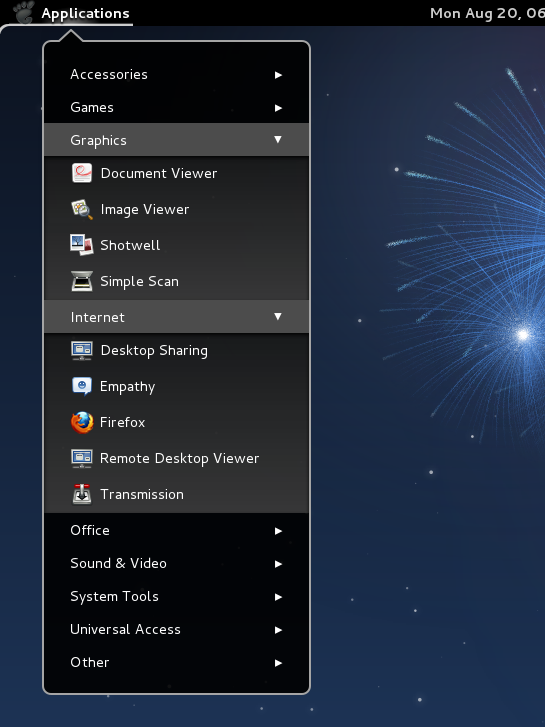
Applications Menu Extension – This adds a GNOME 2-style menu to the desktop. Note that it does not replace the Activities button. It just adds a familiar menu style to the desktop. Each application category is like an accordion’s panel.

Clicking on any reveals the applications in its category.

Frippery Applications Menu – Is just like the Applications Menu Extension above. The features and functions are just about the same. The main difference is that the Frippery Applications Menu replaces the Activities button, while the Applications Menu Extension adds a menu right beside the Activities button.

Here is another view of it.

And here is yet another one.

Axe Menu – Is the best of all three. Like the Frippery Applications Menu above, it replaces the Activities button. However, it offers more features and also has a Settings manager that allows you configure almost every aspect of it. By default, it opens to the Favorites view and occupies a significant portion of the desktop real estate.

Here is the Applications view.

And here is the Settings manager. You open it by right-clicking on the menu’s icon.

Here is the Favorites view after messing with the Settings manager for a few minutes. Takes up less desktop real estate.

And here is the Application’s view.

Just in case you need my opinion on which one to use, do not waste time with the Frippery Applications Menu and the Applications Menu Extension.

