Lancelot is one of three menu styles for KDE, the K Desktop Environment. It is similar in some respects to mintMenu of Linux Mint, but with a lot more features and a lot more configurable options. This article is written to showcase all the features of this menu, which is developed and maintained by Ivan Čukić.
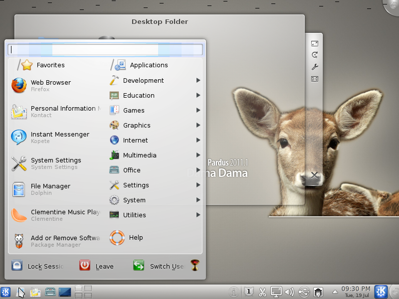
The screenshots used in this article were taken from an installation of Pardus 2011.1. (See Pardus 2011.1 review.)
Our first screenshot shows a default view of Lancelot. Aside from the buttons column, there are two main visible columns – the Favorites and Applications Category column. You can make the buttons column narrower by right-clicking on any of the button icons and selecting the only available option.

Which gives you this view. Notice that the buttons column is now narrower. You can remove an application from the Favorites column by right-clicking on its name and selecting the only available option.

If desktop real estate is really at a premium, you can configure Lancelot to show the buttons inside the applet, that is, right next to the menu icon on the panel. Doing that gives you this view.

When you click on an application category, it collapses into the space originally occupied by the Favorites column, revealing the applications under it. To add an application to the Favorites column, right-click on it and choose the only available option.

The next three screenshots show Lancelot’s configuration options, which you can access by right-clicking on the menu’s icon. This screenshot shows that you have a choice of icons and that you may opt to have the menu open simply by mousing over it.

And this one shows the activation options. Categories may be activated on hover or by clicking.

There are several search plugins enabled by default. You can choose to search Wikipedia and other Web-based sources straight from the menu’s search box.

This just shows the menu’s search box in use.

Lancelot can be configured to open categories in a popup menu, and this screenshot shows just how that looks.

And here is what happens if you click on a sub-subcategory. This ability to open categories in a popup is an experimental feature, but it seems to work quite well.

Lancelot is not perfect, but it is so much better than the alternatives that you should at least take it for a spin. Let us know what you think.


Will Lancelot be ported to KDE/Plasma 5? This is very important to me. I like your manger over the standard plasma manger’s.
how can i install this menu in openSUSE 12.1?
Great tip, well written.
Thanks.
Video ad in the top-left corner which starts automatically is absolutely disgusting!
It does not relate to the post content though. It is brilliant. But I won’t share this site because I don’t want my followers to listen to annoying video ad.
… definitely the best menu for KDE… hat’s off to developer!!! 🙂
Lancelot should be made default in KDE so that easily can switch between Lancelot and the KDE Classic Menu and Kickoff.
Definitely Lancelot-menu is one of the best one in its class.. its so useful and stylish.
“And here is what happens if you click on a sub-subcategory. This ability to open categories in a popup is an experimental feature, but it seems to work quite well.”
This is the ultimate that I have been waiting for and should have been one of the first feature in Lancelot and Kickoff menus. One reason why many users kept switching back to the classical hierarchical menu is because it is faster, uses less landscape and needs less mouse clicks. This feature is going to change all that and Lancelot will do what Classical does and a lot more making it the most preferred menu.
Keep up the good work and make sure this feature is flawless, fast and elegant.
Congratulation on a Great Job.
Awesome! Thank You!