GNOME 3.12 was released on March 26 (2014), but it didn’t start shipping on many distributions until very recently. In this post, I’ll let you in on what I think about it; the cool (good) features and those features I think the developers need to take a closer look at and try to make it better and more user-friendly.
If you’ve been keeping track of the development of GNOME 3, you’d know by now that a wide gulf separates what the GNOME 3 developers consider user-friendly and what most users think that term should mean on the desktop. This is really just about GNOME 3.12, with the default GNOME Shell, not a customized or modified version. Just the latest (GNOME 3.12) plain-vanilla GNOME Shell.
The screenshots used in this article were taken from a test installation of Antergos running in a virtual environment and also on real hardware.
Starting from the login screen, this is what it looks like. It actually looks very cool. I like it, but a part of me thinks that the clock could have been located outside the user login box, so accessing it does not require an unnecessary mouse click.

That I think is a minor thing. That appears to be the trend in modern desktop design. Most tasks tend to require an extra mouse click or two than on older desktop environments.

A new feature is the the ability to pick a different background for the login screen. It’s cool.

Just so we know that we are dealing with GNOME 3.12, this screenshots reveals the specific version that came with Antergos-2014.05.26.

Now this is the desktop. That, by the way, is not the default wallpaper. It’s just the one that I chose to use for these screenshots. The default wallpaper is the same one you saw in the screenshots of the login screen.

One feature visible in this screenshot that I don’t agree with, is the default status of Location. It should be disabled out of the box.

The default installation of Antergos GNOME was missing several core GNOME apps. That’s why the calendar in this screenshot is missing the “open clock” link.

The Activities view of the desktop.

And the app view. If I could influence the design of the GNOME 3 desktop, one feature I’d like to see brought back is application category. It doesn’t make sense to exclude it from the app view. With the current design, I can’t, for example, bring into focus all the apps for a specific task. For example, if I wanted to see all the game applications that are installed, I couldn’t do it. We need the application category back. At least I do.

The real problem with the GNOME Shell in its default state, is that it tends to get in the way. And that’s because, as I’ve pointed out above, many of the settings don’t make sense. Take another case, this time, the titlebar buttons. By default, application windows only come with a close button. To me and the way I use my desktop, it’s annoying. Fortunately, at least on Antergos GNOME, the Tweak tool is installed out of the box, so adding maximize and minimize buttons to application windows takes just a few mouse clicks.





Antergos’ GNOME looks to be quite a long way from stock. You might want to test with a Fedora Rawhide nightly instead; that’s a lot closer to stock GNOME.
Particularly, Antergos’ GDM (login screen) layout is nothing at all like a stock GDM.
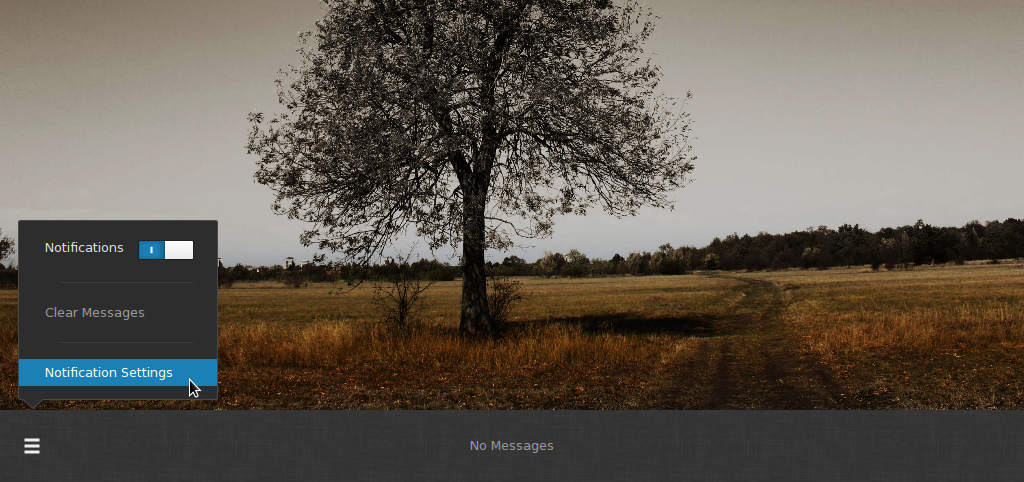
The notifications appear if you mouse quite ‘hard’ against the bottom of the screen – not by ‘touching’ bottom right (any more). This was changed several releases back.
Thanks. I have an installation of Rawhide in VirtualBox, so I’ll take a look at it before writing about a stock GNOME 3 again.
Regarding the notifications, I was essentially headbutting it with the cursor. And I always lose count of how many times I do that before it opens. The other Hot Corner (top-left) is more responsive.
The ‘pressure sensitive’ thing applies only to the notification area as it’s a whole screen edge, IIRC, not the ‘hot corner’ for the overview – that triggers no matter how lightly you hit it. I wonder if there’s some kind of bug in gnome or the input drivers or between the two, for you? Be interesting to know if it happens in Rawhide.