Fedora 20 has finally been released. It is code-named Heisenbug.
As with each release, installation images for the major desktop environments, hardware platforms, and the Cloud, are accounted for.
Aside from installation images for the GNOME 3 desktop, which is the main edition, installation images for KDE, MATE, LXDE and Xfce desktops are also available. Fans of the Cinnamon and E17 desktops have to install them from the bfo, DVD, netinstall CD image or from an existing installation of Fedora.
While a detail review is in the works, and as a follow-up to Fedora 20 Cinnamon, KDE and MATE screen shots, this article brings you screen shots from test installations of Fedora 20 E17, GNOME 3, LXDE and Xfce.
Fedora 20 E17: Like the Cinnamon desktop, there’s no separate installation image for the E17 desktop. But unlike Cinnamon, which can be installed from the DVD, bfo and netinstall images, E17 can only be installed from an existing installation of Fedora. At least that’s what I found. And even after installing the required package, the desktop looked barren. E17 uses far less system resources than the Cinnamon, GNOME 3 and KDE desktops, but it takes getting used to, if you’ve never it. Click on any image in this gallery to see what the desktop looks like.
- The login screen.
- The default desktop on Fedora 20 E17.
- Another view of the default desktop on Fedora 20 E17.
- Yet another view of the default desktop on Fedora 20 E17.
- If you are guessing that there’s very little to show from my test installation of Fedora 20 E17, you are right. There’s very little to show. Even after installing the required package, the system looked barren.
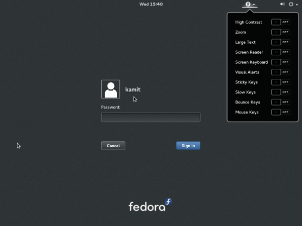
Fedora 20 GNOME 3: GNOME 3.10.3 is the version of the GNOME 3 desktop that shipped with Fedora 20. And it features the GNOME Shell in its default configuration. For users like me, that means at least 45 minutes customizing to look and feel like a desktop designed for productive work. The login screen is shown the screen shot below.

Click on any image in this gallery to see what the desktop on Fedora 20 GNOME 3 looks like.
- The first window you see on logging into the GNOME 3 desktop on Fedora 20, is of the welcome app that’s supposed to help you customize aspects of the desktop. However, it doesn’t help you do very much. Setting up online accounts is its best feature.
- More of the online accounts that you can set up using the welcome app on Fedora 20 GNOME 3 desktop.
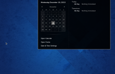
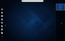
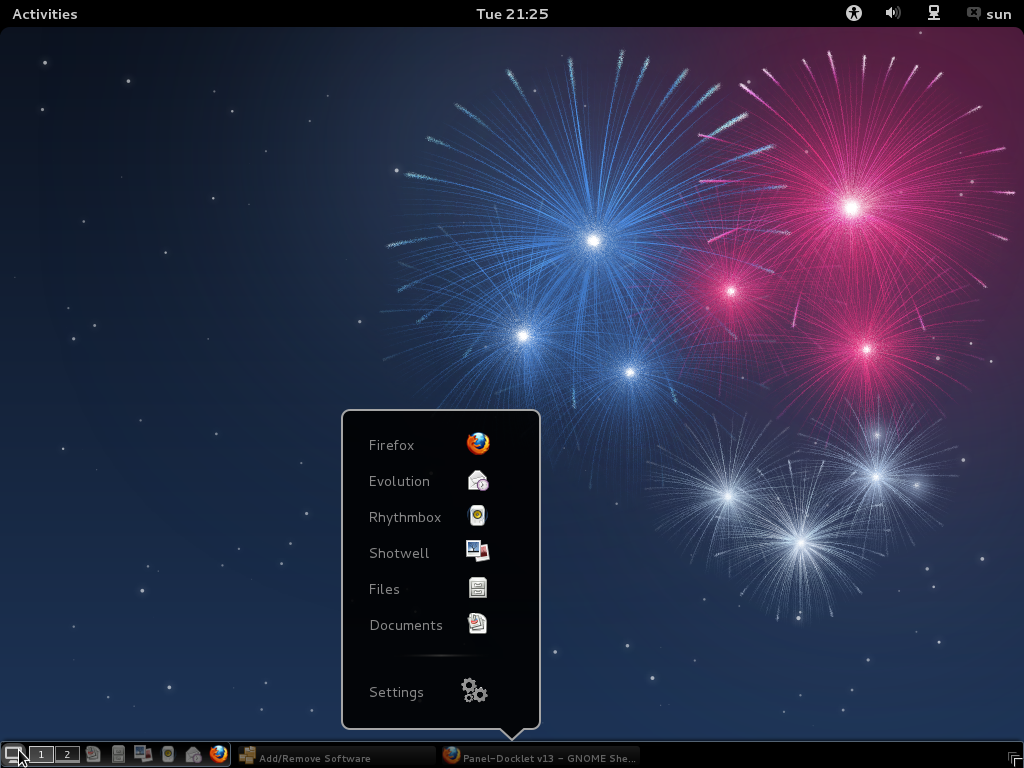
- The default desktop on Fedora 20 GNOME 3. What you get is a GNOME Shell in its default configuration.
- The activities view on Fedora 20 GNOME 3.
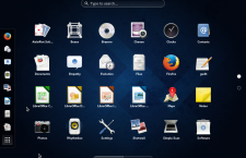
- The app view on a Fedora 20 GNOME 3 desktop. The screen shots in this gallery were taken from a default installation of Fedora 20 GNOME 3 using a “netinstall” CD installation image. Games are not installed by default.
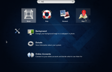
- Using the search feature of the GNOME shell on a Fedora 20 GNOME 3 desktop.
Since the GNOME 3 desktop has a lot to offer, here’s another gallery that shows the desktop’s integrated apps. I’m referring to GNOME Software, Boxes, Maps and Documents. They are nice pieces of the GNOME 3 desktop.
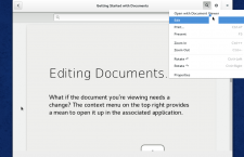
- GNOME Documents on Fedora 20 GNOME 3. It lets you access local and remote (online) documents.
- GNOME Documents on Fedora 20 GNOME 3 desktop. Once your online accounts have been configured, you can access and work on your documents as if they are on your local file system.
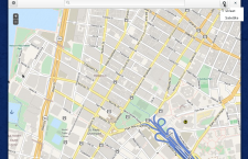
- GNOME Maps on Fedora 20 GNOME 3 desktop. The map app gives you access to a map service provided by MapQuest and Open Street Map.
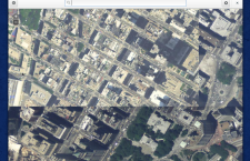
- Setellite view of GNOME Map on Fedora 20 GNOME 3 desktop. The map service is provided by MapQuest and Open Street Map.
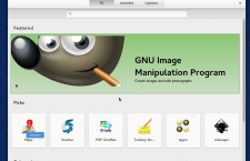
- GNOME Software is an integrated graphical package manager on GNOME 3 desktop. It is still a work in progress, but already looks very good. In the future, we might not need a standalone graphical package manager for the GNOME 3 desktop.
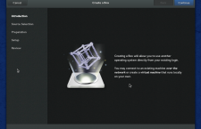
- GNOME Boxes is another nifty application for the GNOME 3 desktop. It is a virtualization app that lets you run other operating system right from your desktop, provided you have the right hardware. It is one of my favorites.
Fedora 20 LDXE: The LXDE (Lightweight X11 Desktop Environment) is for you, if you don’t care for desktop eye-candy. It’s very resource-friendly, using less memory than the Cinnamon, KDE and GNOME 3 desktops. After using the other more modern desktop environments, going back to try LXDE feels like going back to the last century. Ok, that’s probably overstating it, but I think you get the point. Click on this gallery to see what the LXDE desktop on Fedora 20 looks like.
- The login screen of Fedora 20 LXDE.
- The default desktop on Fedora 20 LXDE. Like the Xfce desktop, the LXDE desktop is not designed for eye-candy. Just for a resource-friendly desktop computing.
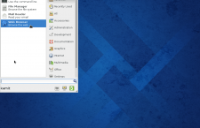
- The desktop on Fedora 20 LXDE features the classical menu. After using a GNOME 3 and a KDE desktop with a menu that has a search feature, this type of desktop menu looks and feels very limiting.
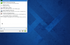
- Another view of the desktop menu on Fedora 20 LXDE.
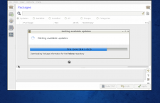
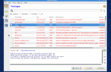
- As on the Xfce and Cinnamon desktops, Yum Extender is also the graphical package manager on the LXDE Spin of Fedora 20.
Fedora 20 Xfce: Like the LXDE desktop, the Xfce desktop is designed to use less system resources. And with that comes very little or no desktop effects. Actually, it’s more like no desktop effects. This screen shot shows the login screen.

Click on any image in this gallery to see the other aspects of Fedora 20 Xfce desktop.
- The default desktop on Fedora 20 Xfce. The dock on the bottom edge holds some frequently-used applications.
- Like the LXDE desktop, the Xfce desktop on Fedora 20 features a classical menu. It has no search feature.
- But the classic menu is not the only option. If you want a desktop menu on the Xfce desktop of Fedora 20, the Whisker menu offers an alternative. Just install the “xfce4-whiskermenu-plugin” using Yum Extender.
- Using the search feature of the Whisker menu on Fedora 20 Xfce.
- And like the LXDE and Cinnamon spins, the Xfce desktop of Fedora 20 uses Yum Extender as its graphical package manager. By the way, Midori is the installed Web browser.
All released installation images of Fedora 20 may be downloaded from here.

