With free software operating systems, a popular practice is to install, out of the box, more than one application for the same computing task. For new users, it is a good thing, since it made it possible for them to test-drive the best applications that their distribution has to offer.
The only downside to the practice is the extra disk space used by the duplicate applications. However, given that nobody complains about lack of disk space, the downside is not really something to fret about. Even at that, the practice is being scaled back – especially with the most popular distributions.
While we can excuse developers for installing more than one application for the same computing task, there is no excuse for what Canonical, the company behind Ubuntu, is doing with the scrollbar.
For reasons that do not make sense, the scrollbar has become a distraction in the minds of the folks responsible for Ubuntu. So they came up with a new type of scrollbar called the overlay- or Ayatana scrollbar.
Their reason(s)? “To ensure that scrollbars take up no active screen real-estate,” and “improve the users ability to focus on content and applications,” while “reducing the waste of space and distracting clutter that a traditional scrollbar entails.”
Seriously?! A scrollbar takes up too much space and is a “distracting clutter.”
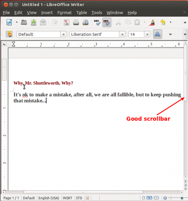
So the solution is to replace the traditional scrollbar shown below…

With this one, so that “a thumb appears magically when the pointer is in proximity to the scrollbar, for easy desktop-style paging and dragging.”

But the problem with the overlay-scrollbar is not just that it is annoying, but that both scrollbars are active on your Ubuntu desktop. With third-party applications (Firefox and LibreOffice, for example), you get the traditional scrollbar, while on native GNOME/Unity applications, you get the annoying or overlay-scrollbar. Beam me up, Scotty.
So, what can you do about the overlay scrollbar? Well, if, like me, you find it annoying, remove it. How? From a shell terminal, type sudo apt-get remove liboverlay-scrollbar3-0.2-0. Or from the Software Center, search for “scrollbar” and uninstall it from there. Restore scrollbar-sanity to your Ubuntu 12.04 desktop.


(it ate my last reply here) Anyway, I wanted to say I think a middelground between old scrollbars and the overlay is better. I like how with an overlay you can move the mouse anywhere to scroll. What I don’t like about them are these points:
1) Too narrow (no border either) – so narrow in fact I’ve more than once not seen them and been confused by the content I’m supposed to be able to scroll
2) The scroll bar stretches to meet the overlay – why?
Just seems to me someone is counting pixels too closely and got rid of some useful visual information. I don’t understand why it’s so important to make these changes…..? Other than the overlay popup, what’s the great innovation here, other than it being so small I can barely see it – which has led to problems?