Linux Deepin is a desktop distribution that is based on Ubuntu. This is a new distribution to me, new in the sense that I have never used or reviewed it. The latest release, Linux Deepin 11.12.1, provides an opportunity for me to find out what it has to offer.
Though I tend to stay away from publicly reviewing distributions that use the default GNOME 3 desktop, I evaluate them privately and if I come across one that has been modified to look like a true desktop operating system, then I will take the time to do what it takes to publish a review on it. Linux Deepin falls into that category. So expect a review of Linux Deepin soon.
While I am still working on the review, here are a few screen shots for your viewing pleasure. If you cannot wait for the review, and want to take it for a spin yourself, download a 32- or 64-bit installation ISO image from here. This first screen shot is of the default desktop. I do not like that wallpaper.

But that is not a big deal. There are dozens more to choose from. This one, from my perspective, is better than the default.

The desktop showing installed multimedia applications.

The desktop showing all installed applications.

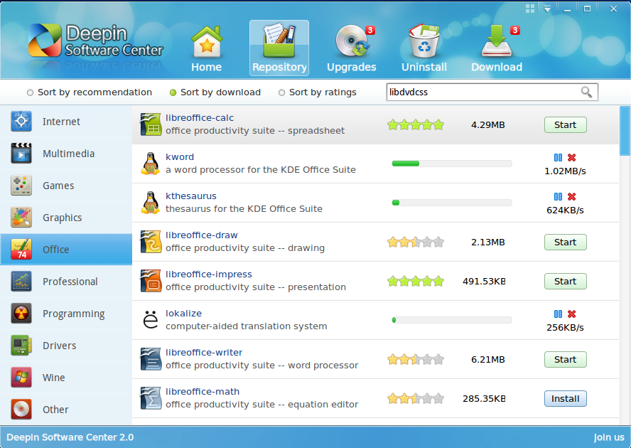
Unlike most other distributions that are based on Ubuntu, Linux Deepin has its own graphical package manager – Deepin Software Center or DSC. Though certain aspects of it are still rough around the edges, it is better than Ubuntu’s Software Center in many ways. This is a screen shot of the top section of the main view.

And this is a screen shot of the lower section.

DSC is themable, and there are six themes to choose from. So, you can pick a theme that is in line with your style or mood.

Just to show one of the six themes. Not my favorite, but so you know what DSC looks like with a different skin.

This screen shot shows mulitple applications being download concurrently. That is one cool feature of DSC, and it does that without requesting authentication for each application that you want to install.




I gave up on Gnome 3 a while back as it was just being messed with so much. People were basically trying to turn it back into Gnome 2 and added a bottom panel. Once you had this bottom panel there was no need for the hot corner overlay anymore, it felt like you were running more than you needed or that there was some sort of identity crisis going on, and the same goes for Unity, it wasn’t long before people started trying to put the unity panel along the bottom and bring back minimize/maximize when you simply click an active applications icon on the dock. If there is nothing wrong with Unity (Which there is btw) then why do so many people have a dock like AWN or Docky running along the bottom of the screen? It just screams the same issues as adding a bottom panel to Gnome 3 does, ie, the functionality the user wants just isn’t there so they try to put it back in. When somebody adds a dock like AWN to Unity, it renders the entire Unity dock and lenses useless, you just don’t need them anymore becuase everything you need is right at the bottom of the screen again where you want it to be.
Needless to say I am a KDE user and i’ve never been happier in my life than I am with 4.8. I’ve been running this system and only adding updates since september and that is the longest i’ve ever stayed with one distro in the 4 years i’ve been a linux user
” … and if I come across one that has been modified to look like a true desktop operating system, then I will take the time to do what it takes to publish a review on it.”
Ok, so I guess one needs to ask what you define as a “true desktop operating system” is?
Is being able to see what programs are being run concurrently important to a true desktop? We can see this in the famous Windows XP, while the Unity desktop has done away with this feature.
If we consider that users may want to have a selection of favourite programs that they can start by just hitting a button the user has placed in some strategic location, like the top of the screen (e.g. Gnome 2) or on the desktop (Windows XP), then again, Unity has done away with this feature.
And if we consider that using a mouse to flick between programs that use the whole screen is much healthier than using the RSI prone “ALT-Tab”, we can see Windows XP and Gnome 2 users will wonder what the problem is, when Unity users start complaining about ruined thumb joints.
All in all, I think you are right to raise the issue of what a true desktop is.
Have you ever even used Unity? Having been a user of Unity since Natty I can confidently say that everything you just said that you cant do in Unity or that they have done away with is simply not true. Running programs are visible in the launcher, you can put your favorite programs in the launcher or on the desktop and launch them with one click, and you can also switch between fullscreen windows using the mouse.
Linux Deepin is pretty awesome btw. I love the way they set up gnome shell with the workspaces and categories on the left. The flow is so much better than the default shell.
Got any good Youtube videos?
Nopa! But a review should be published later today.
Here’s a Linux Deepin 3D alt-tab switcher video http://www.youtube.com/watch?v=5k5uInp3-Ks. And you can download it from then use Gnome tweak tool or ‘Advanced Settings’ to turn it on. Then, Just use Alt+` to show the effect.
Published! Read it at Linux Deepin 11.12.1 review.