I often wonder why Linux desktops are the way they are. You know, why stuff that’s supposed to work out of the box, don’t and why some of the better features of the desktop environments and applications are buried or not enabled by default.
Sometimes I think it has to do with the adoption of a certain ideology by the developers. For example, the developers of Chakra Linux adopted the KISS (keep it simple, s..) principle, which roughly translates into, we give you a bare system, you customize it the way you want. Freedom, they say.
But to me, that’s taking the concept to a level where it works against endusers, the developers and their distribution. It doesn’t make sense. But that’s just me. I like stuff that can just work to do just that. Just work. I like to spend most of my time getting stuff done, not learning how the OS works. I can still do that if I want, but I hate when developers force the issue when it is even not necessary.
The same goes with certain applications, where the default settings don’t just make sense.
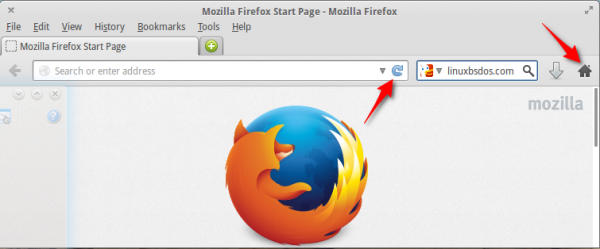
Take, for example, the Firefox Web browser. At some point in its development, Mozilla developers decided to move the Reload, Stop and Home buttons from the left side of the addressbar, where the Next and Forward buttons are, to the end of the addressbar. Why? I have no idea. So the very first thing I do when I log into a new Linux installation and start Firefox, is customize the toolbar. But this is a task that I should not have to do, if only Mozilla developers had left those buttons in their original position.
This is a screen shot of the default Firefox toolbar.

This is what it looks like after I’m done customizing it. This is the way it used to be and this is the way me likes it. It is counter intuitive and counter productive to have the Next and Forward button on one side and the Reload button on the other side. Whose idea was it?

How about Midori, the default browser on Elementary OS and a few other Linux distributions. For reasons that I’ll like somebody to explain to me, you can’t manage (list, view and delete) cookies until you enable the Cookie Manager extension. And you cannot set site-specific cookie policies until you enable the Cookie Security Manager. Why? These are tasks that we know the vast majority of users will perform, so why not enable the tools by default?

And why is it not possible to refuse to accept all cookies when using Midori? Or is there an extension for that?

Dolphin, KDE’s file manager, is another example. This screen shot shows a view of the default toolbar.

This one shows the same toolbar the minute after I log into a new installation of a KDE desktop. Why am I required to do this myself? Why must the location bar be hidden by default? Sane and sensible defaults are what users are asking for. It’s how users decide whether a distribution just works or whether they have to learn how to use the system just to get basic stuff done.

Let’s take a look at another example from Elementary OS, where the Minimize button has been removed from the titlebar of application windows. Why? According to one of the developers (see The Road to Luna):
Certain apps, like Music, were made to intelligently continue to run in the background when closed. For users, this meant a negligible difference between “close” and “minimize” with the side-effect that apps that weren’t in use wouldn’t be sitting around consuming resources.
While that may be true for lightweight applications, I found that starting a “heavy” application like LibreOffice takes a few seconds longer than bringing it back to focus, after it has been minimized. I am currently testing the latest edition of Elementary OS and I’m finding that the absence of a Minimize titlebar button has a negative impact on user experience. This is just one situation where developers made a decision sans adequate feedback from endusers. Even if applications start up faster than Speedy Gonzales, leaving the Minimize button alone does no harm to the system. Sane and sensible defaults, please.
Still on Elementary OS and titlebar buttons, what’s the benefit to users of having the Maximize and Close buttons on opposite ends of the titlebar? I can’t think of any. But that’s how they are distributed on the titlebar of any application window on Elementary OS. Oh, and why is dynamic word wrap not enabled in Scratch, the text editor.

I could go on and on about default settings like these, but I think the point I’m trying to make is clear. If a feature that has the potential to make a system better is not enabled out of the box, to most users, especially new users, it might as well not exist.
Giving users sane and sensible defaults shouldn’t be too difficult to implement.


Seriously? You’re talking about distros like Elementary, or Chakra, which aren’t meant to be mainstream. If you want a good out of the box experience, use Ubuntu, or OpenSUSE ( my two favorite distros ); if you want to customize, use Slackware, or FreeBSD ( two other awesome Operating Systems ), but don’t complain about the customization. You have a choice, use it.
Secondly, as for Firefox, for those of us who aren’t you, we prefer the other way. Your choice is your own, but most people who I talk to like Firefox the way it is. Plus, it’s really easy to configure, so why would you even complain?
Thirdly, most people like breadcrumbs. I like breadcrumbs. It’s easy to configure. Good of the many over laziness of the few.
Fourthly, that Scratch and Elementary shit’s insane. Why would anyone subject themselves to that? I’ve never had that problem with the mainstream distros.
SYG said:
—
Eventually, developers have to pick something. Not everyone’s gonna like it. Fortunately we *can* choose.
So, I think the best way to handle this situation is to make it *very easy* for the user to make customizations. Also, to communicate to the user, “hey, you can make those customizations if you want, and here’s where you do it.
—
And that all makes sense – but then Mozilla steps in and deliberately makes it a royal PITA to get the tabs where they belong in FireFox. What are they thinking? Its as if they know most users will want the setting opposite of their chosen default and they want to -strongly encourage- the users to adjust their preferences to suit the devs’ idea of how it should be done.
If there’s a practical reason why something has to be configured a certain way, then fine – don’t make it user-configurable, just lock it down. But when you have features that clearly work when configured in any of multiple ways and you already have a configuration interface in place, why remove that?
As for showing or not showing a location bar, I fail to see how displaying such will in any way change the user’s ability to “click on a parent folder and dive immediately into the child folder shown in the menu”. Displaying a location does not imply a requirement that you manipulate that location value directly but -not- showing such sure does make it tough for those who might want to manipulate it directly.
Perhaps if users who -want- a “dumbed down” user interface had to actively dumb it down for themselves, we’d find that we don’t have so many dumb users as we thought.
What is sane-and-sensible to you is not sane-and-sensible to another. I’ve found myself adjusting a few toolbars here and there as well, but generally I find apps are pretty sane these days.
Have you ever tried using the software named ‘SANE’? It’s horrible 🙂
What’s not sane and sensible is why when Linux users switch to Mac OS X, they say it just works. The OS just works.
I disagree. I’m a Mac OS boy from the 10.5 era, switched over to Linux when I realized I couldn’t afford Macs ( and I still wanted a POSIX system; no DOS for me, no thank you ). I have a few friends that are Mac people ( artists ), and I tried to use it. What the hell happened? Not allowing me to see the filesystem, having an insane way to scroll, hell, I couldn’t figure out how to put the Applications menu on the toolbar, where it belongs, where it’s been since Mac OS 1. What “Just Works” about that?
“Why must the location bar be hidden by default?”
Because it turns out that paths, esp once they start accessing “fancy” URIs like MTP devices and the like, are not as easy to bounce around and navigate in when you have to edit them by hand constantly. You lose the ability to click on a parent folder and dive immediately into the child folder shown in the menu. It provides a consistency many are now used to from the web.
There are numerous reasons and we both discussed it and tested it before going there.
Is it for everyone? No. That’s why it is configurable.
If something is not to your liking, there may be a reason for it. In the particular case of Dolphin’s location bar there is.
There may also *not* be a good reason (and I think we can all find such cases; I can even point you to some in KDE software) …
… and that’s why Free software needs more people doing quality user interface testing, research and development.
I think FOSS developers do this because they see Microsoft doing it and want to look more like Microsoft. Why would they want to look more like Microsoft?? Because they know that Microsoft Windows is preinstalled on virtually every Tier 1 manufacturer’s computers and most of the Tier 2 ones as well. Not saying I agree with the reasoning, but I think that’s why. I agree with you that the navigation widget (“URL toolbar”) never should’ve been hidden.
Eventually, developers have to pick something. Not everyone’s gonna like it. Fortunately we *can* choose.
So, I think the best way to handle this situation is to make it *very easy* for the user to make customizations. Also, to communicate to the user, “hey, you can make those customizations if you want, and here’s where you do it.”
–SYG
The “We are doing it because MS is doing it” is what made Linux on the desktop so boring for a long time. DE developers were not doing anything new on the desktop. They were basically copying anything and everything that MS did, including the stupid ones.
Imagine if Apple had done the same thing with Mac OS X. Apple did something completely different and people loved it, including the tech crowd, especially the tech crowd. Attend any tech conference and count the number of Mac computers in the audience. Even the tech-savvy just want to get stuff done.
We forget that the vast majority of users don’t want to learn how an OS works. They just want to get stuff done.
I don’t think the Linux feels very MS, it feels much more like the ancient Unix systems I worked on years ago. Very clunky and inconsistent. It’s not really a pleasant UX. I have dabbled with Linux on and off for years and always walked away because it really never “just works” and I really don’t feel inclined to spend the little time I have figuring trying to figure out why.
I guess the truth of the matter is that techies want to keep Linux to themselves. I am always amazed that when something doesn’t work, I get lots of people giving bad advice, and there is always someone who says something like “If your not willing to read the source code/script/.. then your not ready for Linux”. The only conclusion I can come to is that at some deep psychological level, they want users to be impressed with how complicated everything is (and therefore how smart they are).
I think the solution has to be stronger management of Linux applications along more commercial line. I think Ubuntu is on the right track business-wise, but undermined the argument a bit by having a Window 8 type moment.
Good article,
Dear Developers remember we are End Users, in my case I am a Forage Agronomist (Agriculture), that don’t have enough time to try to figure out how to set up certain applications that they should be set up as Default by you. I like to spend most of my time getting my work done.
I am very thankful with the great job you do, but the default set up of the applications you do usually doesn’t make sense.
I guess I could have added a paragraph or two about ROSA Desktop. How there is no Suspend or Hibernate options in its Shutdowm menu.
Or about Linux Mint, and how the workspace switcher is not on the panel by default. Same applies to ROSA Desktop and Elementary OS, btw.
Fedora GNOME 3 and Mint don’t have a single game installed, yet playing games is one of the top bandwidth-consuming activities on the Internet.
It’s an almost endless list of little details that show that distro developers only care about the big picture, refusing to recognize that these “minor” things have a big impact on UX.
I see it more like an issue of “forest versus trees” where the forest is the distribution and included packages are the trees. The people that put the distributions together gather up a bunch of trees that they want in their forest and then offer it to the rest of us as one big package, allowing us to tailor it from there. What they include or exclude is up to them. Many of them do not attempt to tailor many of the trees to their liking, though, which is probably a huge time saver.
So the changes you see in an application like Firefox have little to do with Mint or Fedora, for instance. It would take way too long for the distribution folks to tailor tune every package and it would probably frustrate their users if they did. What is a good choice for you may not be a good choice for me, after all.
Your choices, as I see them, are:
1. Find a distribution that is closest to what you want and modify it from there
2. Roll your own distribution (not for the feint of heart)
3. Stick with the one you’re used to and continue to modify it
It’s the beauty and curse of Linux, it is infinitely customizable to how you want it to be. But that also means that it is highly unlikely to come exactly how you want it to be. Linux doesn’t use the “one size fits all” model that Windows/OSX is famous for. It won’t be the same everywhere you go but you can change it… and that is a good thing.
In the world of Linux, I think a MUCH better idea is to have a global settings manager that handles all of the customization settings for your applications. This way your settings could be backed up and later restored on a new system with every application behaving like you would expect it to. It would then take seconds to bring a system back to your version of perfection. Making the config file loadable on a live system would be even better so you could carry your customizations with you on a USB stick.
Granted, that’s no easy feat to implement but it seems like a much better long term goal than each developer trying to figure out how the majority of users will want to use their software.
Good piece on Firefox – which is a major project for me to set up since I combine all the toolbars except Tabs into the Menu Bar at top and the Add On bar at bottom. FF default is much too barsy for me. Also the device sync seems too complicated when compared with Chrome / Chromium.
This is nothing! Ever install and use Solaris 10? Most of it isn’t configured unless you want to use something. Basic minimum of everything and if you want to use something else, then you configure it!
Is that why Solaris is so popular?
Really??
I’m not saying there are no other examples of bad defaults but I don’t actually understand the problem with some of these.
Maybe these defaults are specific to elementaryOS (haven’t tried it, don’t know) but I’ve never seen Firefox look like that on Linux or Windows installs. I guess you might be used to having all of those buttons together but apart from habit there is no reason not to have the refresh/stop button as part of the location bar considering it is an action on the current address. And I don’t find myself wanting to press back and then straight away stop or refresh – is that a really common action? Because otherwise there is no reason to group those buttons together.
And as for the home button, I’m not sure how many people use that – by default when you open a new tab you get the new tab page which lists all your favourite/most visited sites (and in my experience, most people are quite comfortable with tabbed browsing these days). I think that’s a sensible default. I got rid of the home buton ages ago, there is no use for it with that and the “awesome bar” that has been part of Firefox for years now.
Dolphin – I’m not sure what you’re trying to say there? Is it the lack of a menu bar? I suppose that is debatable, but then again most of the actions in the menus are available in the default interface anyway.
If you’re talking about the location bar, I think the “clickable breadcrumbs” type is a much better default. I get the feeling that when you say new users you mean less computer savvy users – none of them type a location in a file manager, they just point and click their way around.
Even for a keyboard-centric user such as myself, I prefer the breadcrumb type by default. If I want to go a few levels up I might prefer to click the breadcrumb (but then again I might just use Alt+Up or Alt+Back). You can navigate by typing the first letter or two of the folder you want to go to and then pressing enter. If you really need the location bar it is only one click away (or Ctl+L).
I actually find Dolphin to be one of the best thought out applications I have come across, defaults and all. I would like a “new folder” button on the toolbar by default but that’s the only thing I can think of (and it’s not hard to add it yourself).
– a user (not one of those default-choosing developers)
Evidently, I’m not “most people.” I really appreciate the article — and I really object to the way Firefox *changed* its user interface (moving “Home”, new-tab behavior, etc), breaking my established expectations.
YMMV but mine doesn’t!