GNOME 3 Classic is supposed to provide a traditional interface for desktop computing for those not completely pleased with the default GNOME Shell. So when you hear people talk about it, you’d think that it is actually offers a true GNOME 2-ish interface for desktop computing.
But I found out while testing the main edition of Fedora 19 that it is far from a traditional desktop interface. That it is more like a hybrid desktop interface – a fusion of what could be considered a traditional desktop interface and the GNOME Shell.
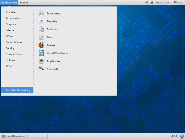
To illustrate my point, here a few screen shots from a test installation of Fedora 19 GNOME 3. This first one is what the so-called GNOME 3 Classic desktop looks like, with its non-classic menu. Note the Activities Overview entry at the bottom of the menu.

Yep, clicking on it is like clicking on Activities in the top bar of a default GNOME Shell. The GNOME 3 Classic comes complete with the Dash, a bottom panel, and four workspaces, or virtual desktops.

And if you click on the last entry on the Dash, you get the application picker view, just like you would get with the GNOME Shell. This shows the Frequent applications view.

And this shows the real application picker view. So what, again, is the difference between GNOME 3 Classic and a default GNOME Shell desktop?

To me, the GNOME 3 Classic looks more like a GNOME Shell modified using a few extensions. And to buttress that point, here is a list of dependencies installed when you attempt to install gnome-desktop-classic, which is the package to install if you wish to take the GNOME 3 Classic desktop for a spin.

Images in this article were taken from a test installation of Fedora 19 GNOME. To download and test it on your machine, you may grab an installation image from here.


If you want low memory usage and produtivity, forget Gnome3, use MATE.
If you want a little bit of effects and produtivity, use Cinnamon.
Only if you want to have a beautiful environment to impress your friends and don’t cares about resources usage, then use Gnome3.
It’s sad but true.
Thanks for the article, I haven’t paid any attention to Gnome since 3 came out, and I actually hated it so much I went back to E16 on my opensuse system. Why do the icons have to be so huge? it looks like it was designed for toddlers. Some of us are actually trying to do work on these systems, yet Microsoft and now the Linux community are trying to make everything look like a tablet interface. KDE is also too fluffy with glowing windows, etc., but at least you can turn on/ off what you want.
The huge icons are just eye-candy, and I think they are good. However, I think there should be an option to reduce their size, just as you can do with the icons in the menu of some extensions.
That’s not actually the case, there is a specific purpose for them (and no, it’s not ‘so it works on tablets’…):
“The avoidance of exclusive application categories and nested sub-menus is a distinct advantage of application launching in the shell compared with the GNOME 2 desktop. Users do not have to guess which category an application is in, and the motor control demands of the application picker are lower than those of menus.”
It’s not quite explicitly mentioned there, but ‘large targets’ is part of the overall ‘motor control demands’ thing. What happened was they did some usasbility testing of GNOME 2 and found that people often screw up when using a classic Win98-style nested menu, especially when using bad laptop touchpads: you have to hit a series of fairly small targets with a particular form of navigation, otherwise you fail. The design of the overview’s app picker is expressly intended to avoid this problem, and the large targets are a part of that.
I agree that Gnome 3 is designed like a tablet interface. In a tablet interface the icons are made large so that they are selectable using a finger on a small tablet screen. There is no reason why they shouldn’t be adjustable in size especially size Gnome 3 is used mainly on desktops.
The avoidance of exclusive application categories and nested sub-menus in Gnome 3 has the disadvantage that the user needs to know/remember the names of the applications. In that sence it’s less user freindly. The Gnome developers could have simply used nested sub-menus and made the selections larger instead of changing the way applications are selected. Both approaches (Gnome 2 and Gnome 3) of selecting applications have advantages and disadvantages. So I think that allowing the user to choose would have been a good idea. The problem is that the Gnome developers have been ideological and not practicle. At least now they are giving the users the choice of using the Gnome 3 Classic mode.
After I installed classic mode my top and bottom bars are still black. How does one setup the colors to the style as shown in the first screen shot?
In fact GNOME 3 Classic is exaxtly what you said: GNOME 3 with addons. The developers have said so. I expected GNOME 3 Classic to be close to the GNOME 2 experience but it’s not; there are considerable differences.
I have been using Mate and Cinnamon both which I like. I haven’t used GNOME 3 Classic long enough to give an opinion on it.
I upgraded from Fedora 18 to 19, when 19 was released. A couple days ago I tried GNOME 3 Classic mode and it worked. I later did a “yum update” after being prompted to update the software. After doing the update GNOME 3 Classic mode no longer works. I get an error message when I try to log in and it doesn’t run at all. So now I’m back using Mate again which still works fine after the update.
“So what, again, is the difference between GNOME 3 Classic and a default GNOME Shell desktop?”
Er…the difference is that you have a nested-menu launcher in Classic? Among many other things? I don’t understand the logic of ‘the overview is also available, therefore it’s just the same!’ If they took the Overview out, would you think it was better? In that case, why not just *ignore the overview and not click on the button that opens it*?
I like the larger targets in Gnome 3 shell. I initially disliked Gnome Shell but after it matured and acquried plenty of extensions I found I could tweak it to my liking within a couple of minutes. It is a very productive environment to work in. When I go back to the Gnome 2 interface, I find it tiring and cumbersome. Cinnamon is just as restrictive.