Summary: This article provides a review of Linux Deepin 12.12, the latest edition of the popular desktop distribution published by Wuhan Deepin Technology Co. Ltd., China.
Linux Deepin is based on Ubuntu Desktop, and it used to be that a Linux Deepin release came two months after the most recent Ubuntu Desktop release. So if Ubuntu is released in April, the corresponding Linux Deepin is released in June. That held true until Linux Deepin 12.06, which was actually released in July 2012.
When Ubuntu 12.10 and 13.04 were released, there were no matching Linux Deepin releases. That’s because after Linux Deepin 12.06, the Deepin developers decided to roll their own desktop environment, one that’s still based on GNOME 3 technologies. The first public release of that desktop environment is the graphical interface that graces Linux Deepin 12.12.
But don’t let the release number fool you, because Linux Deepin 12.12 is actually based on Ubuntu 13.04, not Ubuntu 12.12. Why Deepin’s developers did not make the jump from 12.06 to 13.06 is not something I want to dwell upon here, because ultimately, it is not that important. The aim of this article is to offer a detailed review of Linux Deepin 12.12.
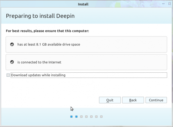
The installer: Before we get to the graphical desktop interface, let’s make a brief stop at the graphical installation program. If you’ve used Ubuntu Desktop or any other distribution that’s based on it, there’s really nothing new here. It’s the same Ubiquity installer, with the same features. Though it’s not as feature-rich as Anaconda (Fedora‘s installer) or the Debian Installer, it offers a somewhat simpler interface for new and inexperienced users. Support is available for LVM, the Linux Logical Manager, full disk encryption, and home directory encryption.
The disk space requirement for installation is 8.1 GB, but that’s just to make room for future usage because a fresh installation of Linux Deepin 12.12 takes just under 4.4 GB of disk space.

If you didn’t know what distribution Linux Deepin is based on, that bit of information is betrayed at the disk partitioning methods step, shown in the image below. Deepin’s developers forgot to remove all references to Ubuntu at this step. Not really a big deal, but this is something they should take care of before the next edition is released.

The New Desktop Environment: Linux Deepin’s new desktop environment is called the Depth Desktop Environment (DDE). For something that’s being in development for less than a year, this first version looks good. There are aspects of it that do not work as advertised, but overall, it’s a good effort, at this stage. The login screen is shown below. Aside from the user account created during installation, and any other created afterwards, there is a Guest account, for those times when you need to give access to the system to a friend or family member.
The unbelievable thing about the Guest account is that anybody logged in using it can install applications using the distribution’s graphical package manager. More on my take on that further down. The other thing about the login screen is that it is not as customizable that of the Cinnamon Desktop Environment.

The desktop itself does not have any feature that wows, but it looks good, very professional. Just by looks alone, you’d be tempted to give it high marks. However, the devil, as they say, is in the details. There is the usual set of icons near the left edge, and a Dock at the bottom edge on which sits some application icons and a System Tray, or Systray. Like the icons on the RocketBar of ROSA Desktop, the height of the application icons on Deepin’s Dock is about twice that of the Dock itself, so they appear to tower above the icons on the Systray and take up more desktop space. It would have been better for usable desktop space if the application icons or the Dock itself could be configured to retract when an application window is open.
UPDATE: The Dock can be set to auto-hide or be “invisible.”. You can do that from the Desktop module of the System Settings.

Out of the box, there are seven application icons on the Dock and five in the Systray. The thing with the Dock is it is fixed to the bottom edge. And unless there is an editable file that one can tweak to change its position, the default position is where it remains. The five icons on the Systray are for the Calendar, User Indicator, Volume Control, Network Manager, and Power Manager. On mouseover, a tooltip shows only for the Calendar and Volume Control. But that’s a very minor glitch. What’s not so minor for me is finding out what the IP address of the machine is. Even when the NetworkManager’s configuration window is open, I couldn’t determine what the IP address is. Here’s the configuration window with the connection types neatly ordered.

And here’s a default view of the wired network connection settings. The IPv4 address of the box is nowhere to be found. You’ll also notice that the IPv4 switch is “Off,” which is strange, because it should be in the “On” position, given that the machine has a live and working connection to the Internet.

From experience, here’s what the window should look like if the IPv4 switch is “On.” What this means is that the only way to find the IP address is from the command-line. Not very user-friendly.

By luck, I found that if I open Iptux, a LAN messenger application, the system’s IP address will be shown when I mouseover its icon in the Systray, as shown in this image.

Probing deeper into the desktop, I found that many default settings do not work as advertised. An example is the Autoplay setting. Contrary to the settings you see in the image below, the system never asks what to do when a new device is detected. (By the way, the entries in the Default Applications tab are properly configured.)

What really happens when a new device is inserted is that a Device Notifier icon appears in the Systray. However, unless you were expecting it to, you will most likely fail to notice it because its icon, like the others in the Systray, is so small and there is no attention-grabbing cue to indicate that a new device has been inserted. Clicking on the Device Notifier icon reveals the connected devices, which are turned “off” by default. They have to be turned “on” before they can be used. I did observe that if Files, the file manager, is open, any external storage device detected by the system will pop up it its side panel, regardless of the switch status in the Systray. I think having to “flip the switch” before an external device can be used is an extraneous step.

The Hot Corner is one of the most annoying features on Free Software desktop environments. On DDE, the top-left and the bottom-right corners are Hot Corners. Mousing-over the top-left corner triggers the fullscreen application launcher.

Mousing-over the bottom-right corner triggers the “Expo” view of open application windows. With both Hot Corners, the problem is they could be triggered inadvertently, which is why the feature is so annoying.

On my computers, I make extensive use of virtual desktops or workspaces, but I found that there’s no such feature in DDE. It’ll likely be implemented sometime in the future, but right now, unless I missed something, the concept of virtual desktops is foreign to DDE.



what i like about deepin is that it comes with flash, some codecs, kingsoft, and skype. i hate how the most popular distros all lack these. i also really hate libre office, because it does not open well on most distros, so it’s always good to have an alternative.
Skype? Isn’t that spyware!
I have tested this distro a lot and it is a shame to find so severe showstopper bugs with dependencies and instability of many apps. This could be avoided with proper testings. These bugs are notorious.
Very detailed!I think this is a very good Linux distribution