Advancement is supposed to make stuff easier to use, but that has not been the case on free software desktop environments. Tasks that used to take one or two mouse clicks, now takes several. Ones that are usually accomplished in one or two phases, now takes three.
GNOME 3 is a perfect example, but it is not the only one. I could cite many examples from the K Desktop Environment too. Even Cinnamon, a desktop environment that was created out of dissatisfaction with the stock GNOME 3 interface, has it share of one-too-many-mouse-clickers.
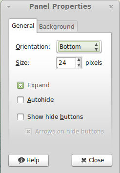
Take the panel, for example, which on Cinnamon is on the bottom edge of the desktop by default. In MATE/GNOME 2, to move the panel to the top of the desktop you would click on the panel, then select Settings. From the Settings window shown below, choosing Top from the Orientation menu will move the panel to the top of the desktop. Nothing more.

Now, let us see how to accomplish the same task in Cinnamon. This was done on Linux Mint 13 Cinnamon (see Linux Mint 13 MATE/Cinnamon preview), the latest edition of the popular Linux distribution. To start, click the panel settings applet. That is the one just to the left of the network manager applet. Select Panel Settings.

On the Cinnamon Settings window, select Flipped (panel at the top) from the Desktop Layout menu. Close the window.

Next, click the panel settings applet. Click on Troubleshoot, then on Restart Cinnamon. That is it.

See, now the panel is at the top edge of the desktop, though it took us one more step that doing the same thing on MATE/GNOME 2.


This is a bit (LOT) of a whine…
Taking too many clicks isnt ok for repetitive tasks but for setting up your panel or themes or any other such ONCE IN A BLUE MOON use, it really isnt a problem.
And when you have multi, multi options to configure a desktop, there is no way everything can be one click away.
Moving the panel IS NOT an everyday function so yeah, have some cheese with the whine.
Efficiency matters, you brain-dead swine.
This article is idiotic. Honestly, you’re whining that you have to click more. So? What next? A rant about how you have to push the power button to get the computer to turn on? Honestly, don’t waste time with trivial crap like this.
So in your world, more mouse-clicks equals advancement?
I never said that. I said it’s a stupid thing to complain about. Most everybody already knows that Gnome 3 is a big pain and is extraordinarily hard to customize. But, for some reason, that’s how they want it. At least Cinnamon LETS you customize it. So, you have to click a few extra times. However, when you compare that to panels that are stuck in their position and you can do nothing about it, then it’s clearly the better option. There’s no sense crying about it. If you don’t like it, just run something else. XFCE is just as easy to customize as Gnome 2 was. You just click and drag the panels wherever you want them. It’s been a while since I used it, but I think that works in LXDE also.
A bottom panel for Gnome Shell is available at extensions.gnome.org, as well as more than one variety of dock, some Gnome 2-style menus, etc.
I’ve been able to customize Gnome 3 as much as I ever customized Gnome 2. Granted, I don’t need to turn my desktop into something put together by a 12-year-old anime fanatic with ADD.
IMO, almost all the ranting about the alleged intuitiveness of Gnome 2 comes from simple experience and familiarity after using desktop with panels at the bottom for years, whether Gnome or KDE or Windows. No computer interface is intuitive. We have to learn them all.
I completely agree with the above comment. Gnome 3 allows an overview to most common applications, tiled windows, custom dock locked apps, and all your virtual desktop with a click of the wrist, or a key. In gnome 2.x, if you loaded your top paned with shortcuts you’d not have the wrist flick, and it would take a lot more customization in ccsm to get the wrist flick tiling and another flick for tiling windows. It is simply a different workflow and once you learn it, it’s hard to go back. It seems to me that if some of the people who complain about Gnome Shell and even Unity would spend that time instead learning it, that we could finally end this conversation. Now that I’ve written this comment, I’ve wasted all that time I’ve saved using Gnome Shell.
Your response is beyond stupid. Why shouldn’t someone complain about inefficiency? Because it doesn’t happen often? Oh, please, take your butthurt, and get out of here. Stop acting like a child just ’cause someone criticized your precious wittle operating system.
Anyone have tried to use something like Gnome Global Menu on Cinnamon? Is it possible? Using the Classic Panel layout if that matters (2 Panels, on on top & one on the bottom of the screen).
All the Google I did came out with reallu contradictory results.
I’m right now on Gnome 3, but I would love switching to Cinnamon, specially if something like Gnome Global Menu works.
That’s a very trivial and unimportant example. Changing a panel’s location is an unusual, one-off event, part of a user’s initial setup of a new environment.
FWIW, I’ve been using Gnome 3.42 on Arch. Y’day, I installed Cinnamon. This morning, when I wanted to launch an application, I found myself tapping the Logo key and preparing to key in the first few letters in its name. Instead, I had to click to open Cinnamon’s menu, scroll to find the appropriate menu category, click it, scroll through that category’s menu, find the application, and click on it.
Sometimes the people advocating the new stuff have a point.
If you hit the windows key in Cinnamon, it should open the Menu, then you can just type the first couple of letters of the application just like in gnome shell, except it’s not gigantic. So if you don’t know the app name it’s easy to use the mouse, without having too use the whole screen. Also the up and down keys will take you through the categories, in gnome shell there is no keyboard way to get to application categories after you hit the window key, you have to hit it with your mouse. So Cinnamon is actually more keyboard friendly.
I also use arch, so not sure why the cinnamon menu isn’t opening when you hit the windows key.
Yes, search is available in Cinnamon. (I’ve switched back to Gnome Shell so I can’t test it at the moment.) The search bar in Gnome Shell is about the same size as in Cinnamon’s menu. It’s huge in Unity, however.
The size of the application overview, and the lack of a way to use keystrokes to navigate it, are, I think, the two weakest points of the Gnome Shell. A similar effect is offered in OS X, where I spend a lot of time. I never use it. OS X, though, also offers a more flexible Dock and the Finder, a much more traditional and much more effective way to get around the file system.
I’d like to see Gnome Shell have the option to display the overview as a Nautilus-like display, with the ability to use the keyboard.
All of these approaches are trying to get at the problem of helping non-enthusiast users find their way around increasingly complicated operating systems and applications. I think Apple’s approach with iOS — small applications that only do one or a very few things –is a better way to go. It’s also rather Unix-y in that approach.
i didn’t exactly hate it, but i tested it shortly at some point last year and thought the gnome shell was pretty much pointless. then i thought i’d actually use it for a while (actually, my primary reason was to test the new fedora). so i discovered i can gui-clicky easy change the keybinds. the speed and efficiency with which i can manipulate the interface via the keyboard is amazing. that and integrated messaging turned me into a fan of sorts very fast 😀 so i’m definitely starting to see the value of the interface but i think the gnome developers simply are doing a poor job promoting and defending their work. i feel there’s a lot of negative feedback out there based on people running the shell for ten minutes off a USB.
Goddess, please throw brains to earth!
They are complaining about 1 (one!) click too many for a task they will perform once!
I believe the format of Gnome 2, Mate, and Gnome 3 – Classic is the best format for a desktop I’ve come across. Icons for the programs YOU choose are placed along the top, while the con-currently running programs are shown along the bottom of the screen.
By that standard you are halfway there. Now you just need to have a bar along the bottom of the screen which shows all the programs running and you’ll be in clover.
Some users just prefer a single panel, and at the top.
I just tried the Cinamon desktop … and yes, you can see what programs are running concurrently along the top, as well as having the ability to add programs to the top pannel.
You can also have both a top and bottom bar, but it doesn’t seem to have the ability to separate the bar the concurrently running programs are on from the one the starting icons are on.
Personally, I prefer Gnome-Classic, but if I had only a choice between Unity and Cinamon then I would use Cinamon.
Isn’t that the beauty of free software – choice.
Am I the only one on this webpage who is willing to tell people that Cinamon does show the concurrently running programs?
Surely “choice” is only a choice if you tell people what the options are?
Not a good idea unless you move hot-corner to some other corner, but then the hot-corner is best suited top-left.