 Linux Mint 10 KDE is the latest release of Linux Mint. It is one of several editions of Linux Mint, a desktop-oriented distribution that is based on Ubuntu Desktop Edition. This release comes more than three months after the main Linux Mint 10 edition was released. The main edition, by the way, uses the GNU Object Model Environment (GNOME).
The following is a detailed review of Linux Mint 10 KDE.
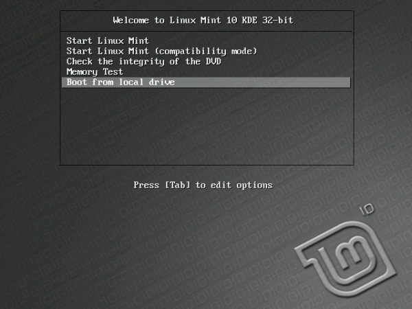
Installation: The boot methods presented by the installation program allows you to boot into a Live environment, the default, or to boot into the operating system installed on the hard disk. Installation can only be initiated from the Live environment.

Installation itself is a basic 6-step process. LVM, the Linux Logical Volume Manager, RAID and disk encryption are not supported. Encryption of the home folder is optional. The default journaling file system is ext4, with ext3, xfs, jfs, reiserfs and btrfs as alternate journaling file systems. A new installation of Linux Mint 10 KDE takes up about 4.5 GB of disk space, and by default, the system is installed on one main partition. The boot loader is GRUB 2, the same boot loader now used by majority of Linux distributions.

You might want to read how to dual-boot Linux Mint 10 KDE and Windows 7.
Desktop: Linux Mint 10 KDE ships with KDE 4.6, the latest stable version of the popular desktop environment. Unlike the main edition, which uses mintMenu, Linux Mint 10 KDE desktop sports the Kickoff-style menu, which is an interesting choice because mintMenu is a whole lot better than the Kickoff menu. mintMenu is not installed, but after installing it, I could not figure out how to add it to the panel. Perhaps this is why it is not the default menu.

If like me, you are not able to replace the Kickoff menu with mintMenu, the Lancelot is another alternative. It is better than the Kickoff menu, and closer in design to mintMenu.

If none of the menu styles appeal to you, you might just as well switch to the KDE Plasma Netbook Desktop interface, which has a higher coolness rating than the traditional desktop interface. Beyond coolness, the Plasma Netbook interface could very easily be the default on any KDE distribution. It has been much improved since the last time I review it.

Package Management: Synaptic Package Manager and Software Manager are two graphical package managers installed by default, which is pretty much standard on all Debian (see Debian 6 review), Ubuntu and distributions based on them. Both package managers are excellent graphical package installation tools. You can, of course, still choose to install applications from the command line using apt-get. Unlike the update notifier on the main Linux Mint edition, which is configured to check for package updates daily, the update manager on Linux Mint 10 KDE is configured to check for updates every 15 minutes, with a 30-second delay on startup.

Installed and Installable Applications: Here is a list of major applications installed:
- Firefox (3.6.13)
- OpenOffice.org
- Hugin Panorama Creator
- Amarok
- GNOME MPlayer
- VLC
- Minitube (a Youtube client)
- KMyMoney, a personal finance manager
- Mozilla Thunderbird mail and news client
- Google Gadgets



when not using my mbp…
on my old pc laptop, i was a user of ubuntu 10.10 downloaded 11.04 & don’t like it. ubuntu 11.04 seems too heavy & confusing now… stuff all over the place… too much pretty…
formatted and installed Linux Mint 10
LOVE IT. clean inter face, faster, etc…
i’ll give up the pretty for light weight, stable, & performance…
Linux Mint 10 is easy on the eye’s and you can change the visual effects to NONE (or if U really need this, EXTRA)… but still looks good.
Can Linux Mint KDE be installed on Windows 7?
If by “… installed on Windows 7,” you mean dual-boot with Windows 7, then, yes.
This tutorial is a good place to start.
If you want to be a good reviewer, at least know half of what you are talking about. This review is pathetic.
Ok, be specific. What part is “pathetic?”
“Desktop: Linux Mint 10 KDE ships with KDE 4.6, the latest stable version of the popular desktop environment. Unlike the main edition, which uses mintMenu, Linux Mint 10 KDE desktop sports the Kickoff-style menu, which is an interesting choice because mintMenu is a whole lot better than the Kickoff menu. mintMenu is not installed, but after installing it, I could not figure out how to add it to the panel. Perhaps this is why it is not the default menu.”
Just the worse bit.
If that’s the “worst bit,” then I’ve got nothing to worry about. A previous commenter already pointed out why “I could not figure out how to add it to the panel.”
What’s bad about that? KDE definitely is popular, and the mintmenu definitely is better than Kickoff. A review IMHO always should contain the opinion of the author, though I have to admit (slight criticism to the “is a whole lot better” term – to which I absoluletly agree) it should have been a little explanation (!) about why it seems to be better in the eyes of the author.
Author of this review and you don’t get it?
Mintmenu is specifically designed for GNOME desktop by Mint team that’s why it’s not default menu in Linux Mint KDE edition.
KDE4 have Kickoff, Classic and Lancelot menu.
GNOME got Menu Bar, Main Menu, and sometimes it depends on distro, MintMenu or openSUSE’s menu (I can’t remember how it is called).
Btw, MintMenu is much better than openSUSE’s menu.
@Tux: If the Mint Team thinks Gnome needs a special Mint menu and is able to create one – why don’t they do it for KDE too? KDE also deserves it. What’s good for the one desktop environment should also be good for the other.
Oh how I wish someone would either port the mint menu to KDE4 – and/or the good old tastymenu which was available for KDE3…
@Jaki
There is no need for Mint menu in KDE because KDE4 got similar menu available under plasma widget’s called Lancelot.
And old tasty menu is called classic, available thru right click on Kicker icon.
Oh, and btw, openSUSE’s GNOME menu is called Slab 🙂
@Tux: definitely NOT, both. Lancelot is another more or less nice menu but it has some bad habbits IMHO. And Tastymenu was not official, it was a three pane menu. I once had hoped Lancelot would go into that direction but it is far far away from it: It doesn’t have three fixed panes, the icons’ sizes are not configurable (biggest point of criticism for me), it looks crowded and messy with the different icon sizes and space sizes between the entries and it switches views=the panes don’t keep their content while browsing the menu! The latter something I absolutely hate. Maybe it would be less pain when I could make it bigger and make all icons bigger and all icons the same size…
Not a bad KDE distribution. Someone made the comment about colors being too dark. I prefer the darks colors to the washed out light blue that most KDE distros have, so +1. The applications selected could be improved. Gnome Player should not be installed especially when VLC is installed. Applications can be uninstalled and installed easy enough so the complaints about having or not having a certain application is really null. If you play with the distro for a short period of time you will be able to find what you are looking for, so nothing is hidden if you put forth a little effort.
Lancelot is a better menu system than the regular KDE kicker menu. I consider it to be better then the mintmenu. I’m not really a fan of their update system because of what they consider to be important and unimportant. I use Synaptic. Even tho Synaptic is crippled somewhat in LinuxMint 10 KDE I still have more choice in what I want to update. Even tho there are a few very minor problems this is a very good release for a KDE distro.
I haven’t looked into the security setup so I’m not sure if they follow the same path or have the same security concerns as LinuxMint Gnome.(Unless you’ve been living under a rock for the last 6/12 months you know what I’m talking about). If a person wants to use a KDE distro then this would be a good choice. Even tho I use Gnome on my main system I consider LinuxMint 5 KDE CE to be one of the best KDE distros ever released.
I must have been living under a rock, what do you mean by this statement “…or have the same security concerns as LinuxMint Gnome.(Unless you’ve been living under a rock for the last 6/12 months you know what I’m talking about)” When I google Linux mint security issues or concerns I find nothing relevant or recent. Can you or someone else point me to an article where these security concerns are discussed?
It’s a pity that Mint doesn’t concentrate more on KDE. Wish it would be Mint’s default GUI. And I’d wish someone would port the excellent mintmenu to a KDE plasmoid! Can someone please switch on the lights? The default design is way too darkgrey. Where is the nice and friendly KDE blue?
There are many blue wallpaper included in Linux Mint KDE, where Gnome and others have green ones. Many wallpapers from 9 and even some from previous versions are still there, and changing the wallpaper is very easy.
With Linux Mint, you are really not bound to this grey color.
I know it is easy to change the look once Mint is installed. But I like to use the Live CD to present Linux to others and to show off a little. And trying to show off while saying “yes I know it looks trist – but you can change the design” is only half the fun.
I like Mint with Gnome.
For me are Ubuntu and Mint best with the Gnome desktop.
If you must have KDE I think PCLinuxOS 2012.2 or Pardus 2011 are much better choises.
I not realy understand why Mint get involved with KDE at all.
Would be better if they got focused on Gnome.
Can you tell us why the KDE editions of PCLinuxOS 2012.2 and Pardus 2011 are much better than Linux Mint 10 KDE?
I was not impressed with mint kde, as there was one major flaw with kde, and that was when one wants to use a 3g dongle. This works flawlessly under mint gnome and under kde 4.6 it does not work. Also control center in gnome edition i find better and everything is is one place, but with kde, one has to go searching for things.
MintMenu is non-compatible with KDE.
From what I see, Mint team messed up Ubuntu and KDE. Much worse that Kubuntu. Will stick to later.
BTW… here are my reviews of Mint team “productions”.
http://linuxblog.darkduck.com/search/label/mint
Yuk in all manner of typefaces,…hideous and ugly
so gross and crass distro
I love this edition. I used the GNOME version of Mint before but with this version I switched to KDE one. KDE is getting so much more ahead in every way (functionality, awesome looks) I’m starting to miss al this in GNOME. And unfortunately with GNOME 3 they just made it worse. That’s what is so cool in Linux, there is always choice and if one option gets behind or changes in the way you don’t like you can switch to other options.
Who the hell wants gnome mplayer? There’s much better SMPlayer.