![]() Ubuntu 11.04 Alpha 1 is the first release in the run up to Ubuntu 11.04, aka Natty Narwhal. The unique feature of Ubuntu 11.04, when it is released, will be the Unity interface, which will be the default desktop interface on computers that meet the minimum hardware requirements. Other computers will be able to use the Classic desktop interface.
Ubuntu 11.04 Alpha 1 is the first release in the run up to Ubuntu 11.04, aka Natty Narwhal. The unique feature of Ubuntu 11.04, when it is released, will be the Unity interface, which will be the default desktop interface on computers that meet the minimum hardware requirements. Other computers will be able to use the Classic desktop interface.
This review, a very short one, is meant to offer a glimpse into what is in store on Natty Narwhal. Since most of the features will be unchanged, this review will focus primarily on the newest feature, which just happens to be the Unity interface.
Before addressing Unity, let me highlight a couple of observations about the installer:
- It is the same installer, but the minimum space required for a complete installation is now 2.7 GB instead of the 2.6 GB of previous releases. Minor, but no harm done in bringing it to your attention.

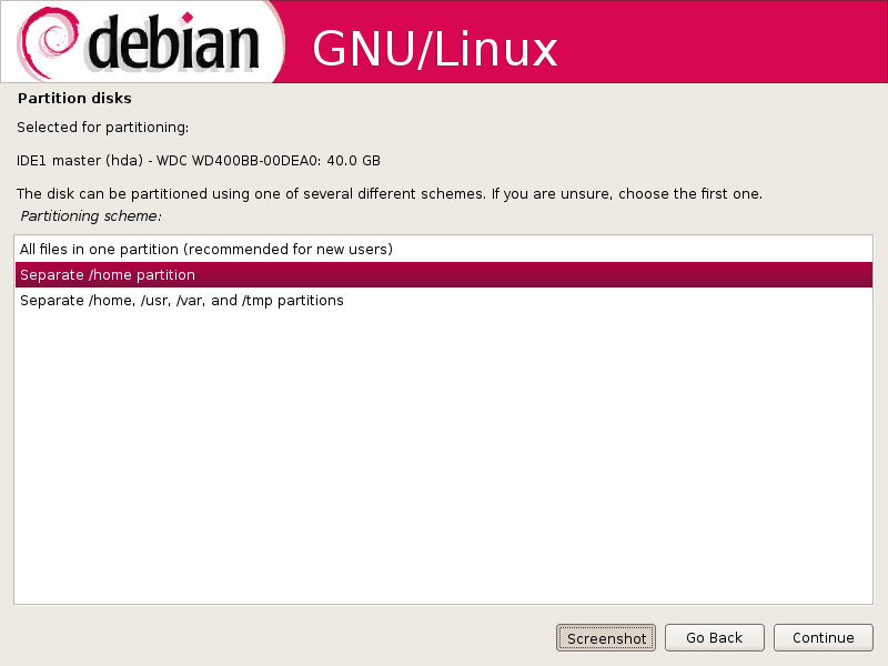
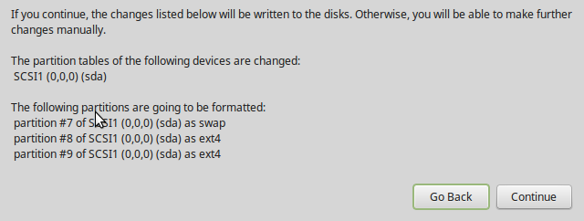
- The installer does not have the option to install onto free space on a hard drive that has another operating system on it. I am not referring to unused space on the existing operating system’s partition(s), but rather, to unallocated space on the hard drive.

Take the test installation for example. The hard drive on the computer is 320 GB, with Linux Mint 10 installed on about 250 GB, with the rest unused (free space). You can tell that the installer does not see the free space. To install on the free space, you will have to do a manual installation, that is, click on “advanced partitioning tool,” or choose “Specify partitions manually (advanced)” from the previous step. This is not something specific to this pre-stable release of Natty Narwhal because I found this to also be the case on Ubuntu 10.10 (and also on Linux Mint 10).
The installation program of distributions, like Pardus and Fedora, offer the option to auto-partition and install to free space.

Now, to the installed system. Will Unity in Ubuntu 11.04, when it is finally released, going to be any different from Unity on Ubuntu Netbook Edition? From what I have observed, only slightly. Keep in mind that some of Unity’s features are not implemented in this alpha release. Unity is one of five netbook-optimized interface available on Linux and BSD distributions.
There is still that fixed launcher to the left of the desktop, and the top panel. Since this is a distribution designed for standard desktop computers, the argument about the launcher taking up valuable desktop real estate, which I made here, does not apply. The problem remains, however, that the Launcher is not very flexible,

Out of the box, Unity offers four workspaces.

Open applications windows have their menu bars on the (top) panel, rather on the application window itself.




That’s god damned right. The home button is a mile away from my bookmarks, and the refresh button now looks like a tiny afterthought.
–also–
11.04’s native environment is plain terrible. Managing to make it hard to find administration, and preferences was only the least of it’s visual and user-friendly blunders.
The new sliders in 11.04 are glitch-city, even when i log in in “classic mode”.
epic fail ubuntu, back to
Word…
ubuntu 11.04 is very goood….i like it
Natty Narwal is yet another ubuntu improtant to ubuntu world. But i think the alpha version ahs got several bugs. I found that it doesnit shut down on my machine. Got some machine dependent problems . . .
To know more about Natty Narwhal
http://techbrim.blogspot.com/2010/12/ubuntu-1104.html
It does not offer ‘install to free space’?
What exactly does the ‘install alongside other operating systems’ do then? Did you try that?
“Install alongside other operating systems” will resize the space allocated to the existing OS on the disk. It does nothing to the unallocated space on the disk.
> Open applications windows have their menu bars on the (top)
> panel, rather on the application window itself.
How well does this work with non-GTk apps, such as KDE’s K3b or the Qt app QDVDAuthor? Really, just asking as an exercise — I don’t expect to run this distro.
Why don’t they just use Window Maker and be done with it. About Firefox 4, and more seriously, I personally hate all this re-arranging of tabs and buttons, having to travel further to switch tabs is not exactly a good experience. Still following MS, IE started shuffling the interface around until it made no sense, everybody else thinks they have to follow. When will they learn not to constantly f@ck around. If it ain’t broke don’t fix it.
I think you’ll find the tab layout is inspired by Chrome moreso than IE – which has traditionally lagged behind Mozilla browsers. I’m not sure which revisionist history you are reading that indicates Firefox UI tweaks are in any way prompted by Microsoft’s ever changing (and oft maligned) IE interface.
the update to Firefox 4 came before the IE update, plus on my windows 7 machine i found Firefox to be better than IE, chrome and safari, especially with the availiable addons for Firefox
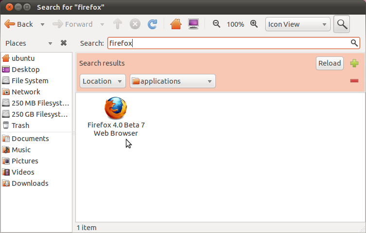
The search feature you ascribe to Unity is actually from Nautilus.
Unity’s search was in the dash and will return later on. It will be Zeitgeist-powered and therefore, awesome. 🙂