The first beta of what will become the next-generation KDE Plasma workspace (KDE Next) was released yesterday. The final release is scheduled for release sometime in July (2014), so things should be moving really fast from now on. Here’s an excerpt from the release announcement:
The Plasma team would like to ask the wider Free Software community to test this release and give any feedback . Plasma Next is built using QML and runs on top of a fully hardware-accelerated graphics stack using Qt 5, QtQuick 2 and an OpenGL(-ES) scenegraph. Plasma Next provides a core desktop experience that will be easy and familiar for current users of KDE workspaces or alternative Free Software or proprietary offerings.
After playing with the test ISO image that was made available, I can confirm that the “core desktop experience” of Plasma Next will indeed be no different from that of the current KDE workspace. The desktop effects will, however, be much better and smoother. I was expecting a redesign of the KDE System Settings, but that doesn’t look like it’s going to happen. It’s the only component of KDE Next that looks out of place.
In any case, here are screenshots from a test system that I set up.
The login screen.

The desktop.

The desktop showing the menu. The menu still looks very much like the current Kickoff menu, but it just feels a little bit “lighter.” I’d rather have a fullscreen app launcher, but I think the developers are relying on Homerun Launcher to feel in that need.

There is an integrated search field, but it doesn’t show until you actually start typing.

The panel settings widget does not open in a settings window, but in place, right on the panel itself.

The desktop showing two open windows of the KFind utility.

A screenshot of the System Settings. The Compositor module is a new addition.

This is a screenshot of the Compositor module. Its settings are what you will find in the current Desktop Effects module.

The Desktop Effects module settings still look like the current one, but one of my favorite settings (Wobbly effects) appears to have been removed. It doesn’t really work very well in the current workspace, but kids love it.

The widgets manager.

A screenshot of the desktop showing the NetworkManager widget.

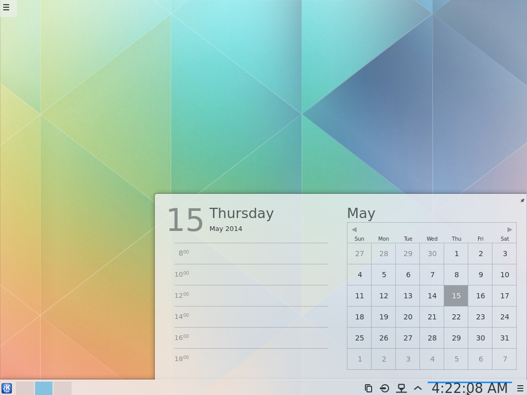
And finally, here’s what the panel calendar looks like. If you would like to take the system out for a spin yourself, you may download an ISO image from here.


I am particular to the classic application launcher. I would love to see a search feature there as well. Would sure come in handy.
Wobbly Windows is of course still available. But as we can see in the compositor screenshot you are running the XRender backend. Wobbly Windows has always been only available on OpenGL. And that’s the reason why you don’t see it in the list – unsupported effects are hidden by default now. There’s a configure button next to the search field which allows to include the unsupported effects.
Well, cool.