Now that the first beta edition of what will become Fedora 19 has been released, and almost all the accepted features are at 100% completion, I downloaded the installation images for the released desktop environments and ran them in a virtual environment just to see what they have to offer.
True to every Fedora release, most of the new features and improvements from the Fedora team are mostly for enterprise and expert-level users. Very few are fro regular desktop users. The most exciting features for desktop users I found are in the GNOME 3 edition, which is turning out to be the best desktop environment we have going, that is, after you tweak the default GNOME Shell with a few extensions.
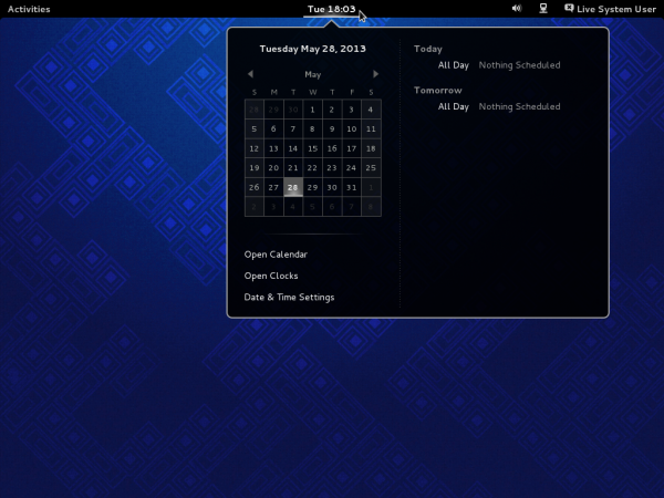
The following screen shots show what the latest GNOME 3 desktop looks like and a few new features it brings to the table. Also included are a few screen shots from the other desktop environments.
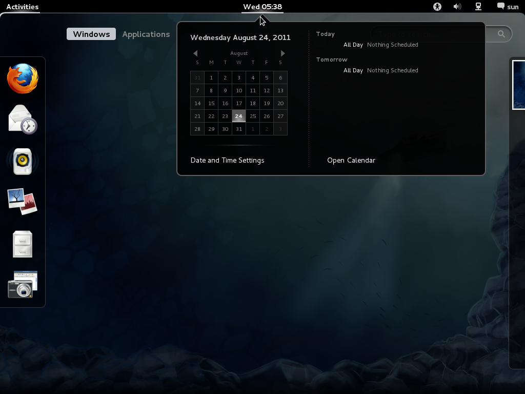
The GNOME 3 edition features the latest release of the GNOME 3, which is GNOME 3.8. While the default GNOME Shell is still the same that I’m not a very big fan of, there are some useful and very user-friendly features that factor nicely into my desktop computing needs. The calendar is not one of those features I like, but the clock, me likes!

The Clock not only allows you to set and see the time in different regions, but it now has a timer, alarm and a stopwatch. Though this looks nice, I like the implementation in GNOME 2 when the configured regions are shown when you clicked on the panel date.

The Alarm allows you to set inter-day alarms, but what about intra-day alarms? Jot yet, but that could be implemented easily, Perhaps there could be an extension for that.

The stopwatch.

The timer.

Activities, whether on KDE or GNOME, still don’t fit into how I use my desktop.

The implementation of the applications menu now makes a lot more sense to me.

The looks nice, but in addition, Linpus Lite’s implementation of an application category screen looks even better (see ). I must say that the Sundry and Utilities category looks just like that except that they are mixed in with the rest of the applications shown in this screen.

The KDE edition ships with KDE 4.10, which for me, still looks no different from the previous release. Because of a disagreement between the KDE team and the ROSA Lab team, a few of the best contributions from the latter will probably never make it to the mainline KDE desktop. That’s why I prefer the KDE edition of the ROSA Desktop to any other.

I think it’s time to retire the Kickoff menu.

After using the latest GNOME desktop and even the latest Linpus Lite desktop, the LXDE, Xfce, and MATE desktops look very last century. I’m sure a lot of people still prefer them to GNOME 3, but not me. I’ll never touch these desktops again, except for review purposes. This screen shot is of the LXDE desktop as it shipped with Fedora 19 beta.

The LXDE desktop showing the entries in the Preferences menu category.

Think that LXDE and Xfce look old? The MATE desktop looks even more out of place on a modern desktop computer. This is the default desktop as it appears on the Fedora 19 beta.

And this is the same desktop showing installed applications in the Internet menu category.

The Xfce desktop.

Another screen shot of the Xfce desktop.

And yet another screen shot of the Xfce desktop.

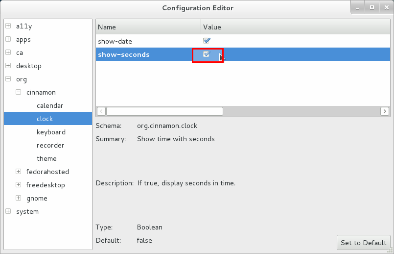
Though there is no separate beta edition for the Cinnamon desktop, packages for it are in the default repository, so you can install them if you’d rather use Cinnamon than any other desktop environment. This is the default Cinnamon desktop on my test installation.

To download any of the released installation images of Fedora 19 beta, visit here.



I was first impressed with the glitter of Gnome, until, because of a second user on my pc, who preferred KDE, I did a group install of KDE. I also added some workbenches for C and C++ and QT and now, the All section of the menu exceeded 200 icons. If I add a few games that side will be up to 250 icons in a short while.
The frequent side is just that, it collects things you looked at, and lets this screen get full. After that, it bumps the older items. Here too, because you look at something to determine what it is, it gets added to the frequent side of the display. Frequent is the wrong name, it should be titled recent.
The interface has some redeeming features. Grab an open window and slide it against a margin. It will fill to half screen width, allowing another window on the other margin.
In the applications, to setup parameters, you have a panel at the top of the screen. If you see the mini-icon representing your application, right click on it and it will open with options to set preferences.
I for example, added Immediate Delete option to nautilus.
I use dropbox, and that installed just fine.
Eventually, a downloadable miniprogram to search for tweaks should be included. Otherwise, the GUI interface is hoo-humm.
Fedora itself has some wonderful enhancements, well worth making it your distribution of preference. I am certain that much more about these features will be written about soon
Cinnamon’s also available from the DVD/netinst installer – there’s just no live version of it.
We could have mentioned the massively refined anaconda, the new initial-setup and gnome-initial-setup, the new MATE live spin and various of the GNOME 3.8 features as ‘end user features’ for Fedora 19; perhaps we should have, to make it sound more exciting 🙂 So yeah, remember those.
Hey, man, this wasn’t really a review. Just some scree shots.
In any case, Anaconda looks good, but I’m begging for the simplicity of the old Anaconda’s partitioning methods. On GNOME 3.8, yes, it totally rocks! In my book, it has KDE beat in a lot of places. It definitely feels more integrated than KDE. But I’ll save the details for when the final ISO images hits the download mirrors.
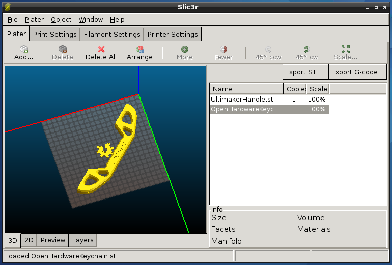
Until then, I’ve got to start shopping for a cheap 3D printer 😉
What did you find simpler with the old anaconda? Are you talking about the screen which offered five or six sort of partitioning ‘actions’ – iirc, ‘nuke everything’, ‘nuke existing linux partitions’, ‘use empty space’, ‘shrink an existing partition’?
Yep. Those options made automatic partitioning a breeze. With the new one, if I want to blow everything that’s on my HDD, I have to go thru steps that are not necessary.
I’m not pinning for the old software, just the simplicity of automatic disk partitioning that it brought to the table.
I’ve installed Fedora 18 three times (on different machines) and I really have to say that, after a bit of experience, the new installer works well and it’s not so difficult to use! 🙂
‘Because of a disagreement between the KDE team and the ROSA Lab team, a few of the best contributions from the latter will probably never make it to the mainline KDE desktop’?
Do you have more info about this? thanks.
The ROSA UI team lead wrote about it on his blog, and you can read the email exchanges here.
ok thanks