After more than a decade of slow, but steady coding, Enlightenment version 0.17 or E17, was released late last year. Enlightenment is a window manager-cum-desktop environment for Linux and other UNIX-like operating systems.
It is one of those projects that caught my attention years ago, but which I decided, after playing with it for sometime, that it was not yet ready for prime time. I’ve been quietly tracking its development since.
The last time I took it for a spin was early last year. I was not too impressed then, and dropped it. But now that the “stable” version has been released, I decided to give it another try. I did that using an installation of the latest edition of Bodhi Linux, a desktop distribution based on Ubuntu.
Most of the features are great and I think it is ready for your desktop. But there are still some very rough edges. The basic thing you need to know about E17 is that it is resource-friendly, and will run on very old computers. But if it will run on old computers, imagine how it will fare on that “supercomputer” sitting on your desktop or on your lap. Also E17’s window-compositing is hardware-independent. You can read the previous article published about E17 heer.
What about those “very rough edges” referred to earlier? There’s not a whole lot, but here are the ones I noticed in the few weeks I’ve been testing Bodhi Linux, and which I think you should know about before you take any E17 desktop for a spin.
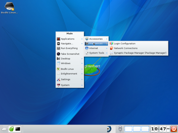
1. Where’s the rest of the menu?: This does not need any explanation. Just look at the next two screen shots.

But it is also not a big deal. When you want to access the menu from the desktop, just avoid clicking too close to the right edge of the desktop.

2. The File Manager: You’ll want to take note of this one. Every desktop environment needs a good file manager. Right now, E17 does not have a good, native one. That’s the bad news. But it’s not that bad, because there are alternatives in the repository of the distribution you are using. For example, in Bodhi Linux, there is Dolphin, KDE’s file manager, Nautilus, Athena, etc. I hope the developers put more effort addressing this one.

3. Tooltips: One thing that was immediately obvious as I played with an installation of Bodhi Linux, is inconsistency in the behavior of tooltips. Take the screen shot below, for example. With the mouse over an icon on the panel, you can see that the tooltip is atop the icon, rather than outside of it.

But when a cursor is on a window’s icon on the taskbar, there is no tooltip. Perhaps the appearance of tooltips is configurable. If it is, I’m yet to find out how to configure it.


E17 will never be rdy for prime time without being run through XFCE’s user interface
layout guidelines and being given a (a total disection) by XFCE’s user interface layout
and guide lines manager on every element that is a part of the desktop environment.
Who ever the person is that does that for XFCE, they need to hire or borrow him/her for awhile,
they will not make any headway until they do.
@lpbbear: PCLOS recently had to rebuild their repository servers, and if you’re not getting updates, you need to visit the site.
Bodhi was pretty, and fairly light by my #!-loving lights. But I wasn’t really able to get things how I wanted. For example, If I used larger fonts, a number of UI elements (like buttons) did not scale.
I’ve been using Bodhi Linux for two years. It is a huge help if you take the time to read the wiki that comes with the rest of the documentation. Bodhi works great for me and I used to one of those distro hoppers. It’s stable and is lightning fast. Also the themes aren’t bad either! No more distro hopping for me. I’ve found the perfect desktop.
I did try out e17 on opensuse 12.2 a couple of months ago, but stopped using it because the econnman just didn’t work.
Personally I’ve been using E17 for several years and wouldn’t want to use any other desktop. I’ve been running PcLinux’s last official E17 release (which is no longer available unfortunately) and ran Elive before that. Since a couple other commenters have set the record straight about the menu so I’ll just say I do agree about the native file manager being way to featureless but PcmanFm is a good alternative.
There is not way of getting Broadcom 4313 support installed easily. There is no easy way of choosing which sound device you want to use. When they get these two issues solved,
then Bodhi will be like Linux Mint…
The first problem I saw with this article is “But it is also not a big deal. When you want to access the menu from the desktop, just avoid clicking too close to the right edge of the desktop.”
Please elaborated a bit. This is not really a problem because if you mouse close to the edge, the menu will automatically adjust.
I also take issue with you calling these EXTREMELY MINOR ISSUES “Very rough edges”. First, for most users these are not problems at all. & Come on man, its still linux which means you can customize it any way you want.
I am a new Bodhi user too, I have seen these things you call “very rough edges”. & the abswers to fix them Check the Bodhi forums or IRC.
Don’t be a drama queen!
The perfect workstation, Debian based running E17.
I’m running Enlightenment DR17 in PCLinuxOS. I don’t think its the latest version of Enlightenment because I don’t believe they have updated the repositories for PCLinuxOS yet. I switched from KDE4 recently because I was sick of glitches and performance issues in KDE. I have to say, other than a few missing features here and there, I am loving Enlightenment. Light, fast, beautiful, performance is a huge improvement over KDE. I am looking forward to the updates being pushed out by PCLinuxOS. Nice!
“E17 is resource-friendly” ??
fvwm running for 11 days: VSZ 110156, RSS 4312
E17 running for 10 minutes: VSZ 451316, RSS 38772
Maybe friendly compared to some bloatware, but…
I tried it out for a while, and I think it might be nice with some more work, but a number of UI quirks and annoyances kept me away for now. I spent some time trying to customize it how I wanetd, and had a hard time doing that. I don’t know whether it just can’t be done, or whether I needed to spend more time.
Enlightenment comes pre-configured for modern systems but can be tuned down (crippled) to compare even with fvwm in performance (even compete) while offering more functionality:
1. Strip enlightenment off the modules that add functionality that is not found in fvwm.
2. Find \ Make a theme that uses solid colors instead of bitmaps for menus and such.
3. Adjust the cache: E17 loads all that eye-candy and icons to RAM. fvwm mostly reads it all off the disk. You can setup E17 to do the same by limiting\disabling the catch.
Note that this is mostly just a proof-of-concept. The end result will be only a slightly better looking fvwm \ openbox with little added value. The advantage of E17 comes to play once you want adding desktop icons or a task bar or even a weather \ news widget. Here, E17 will integrate everything flawlessly while in the minimal WMs you’ll need to add up more and more less-than-perfectly integrated programs that don’t never work right.
Loco,
I’m sort of curious what functionality enlightenment has that is not found in fvwm. The pager module in fvwm has some flexibility I wasn’t able to duplicate with e17 (it may be possible, but after reading docs and searching the web for a while, I couldn’t find any way to do it).
One things I really didn’t like in e17 was that (at least with the way I have things set up) the toolbar had both buttons (to start programs) and icons (of programs running). It wasn’t clear which was which; I didn’t find this convenient, compared to fvwm’s separation of the minibuttons module and the icon box. Perhaps there is some way to make the difference clearer in e17.
When you say “while in the minimal WMs you’ll need to add up more and more less-than-perfectly integrated programs that don’t never work right.” I don’t know if you are talking about fvwm or other WMs. The WM features I use work well with fvwm, but maye I’m missing out on something interesting.
Turning off the cache may help the bloat a bit, thanks for that pointer.
Bodhi was great at promoting e17 but, considering they are using their own configuration for it, it doesn’t seem very elegant. For example, I changed the default icon set to something a lot nicer and the shelf is quite large considering the screen size, of course judging from your screenshots and description. Another thing which doesn’t get advertised a lot but is a great feature is Everything which is similar to Gnome Do, you can execute it with Alt+Esc.
I have to agree about the File Manager, the ugly thing is that the directories in the main menu are opened with it regardless which file manager you set as default. Apart from the above and a small bug with power saving which crashes my computer( so I have to keep it in presentation mode all the time) it’s the best desktop I’ve used in years.
If you move your mouse cursor to the right edge of the screen where the menu seems to disappear, the missing part will slide to the left so you can access it. A little quirky, but it works.
PCmanFM, the LXDE file manager, is probably a better lightweight alternative than the native E17 file manager at this stage of its development.
Regarding the disappearing menus, if you move your mouse cursor against the right edge, the rest of the menu will appear.
PCmanFM, the LXDE file manager, seems like a better lightweight alternative than the native FM in its current state. Easy enough to install, though.