The first beta edition of what will become Elementary OS Luna has been released. Luna is a bold attempt to revamp and completely retool Jupiter, the distribution’s first edition. I got a first look at what Luna will bring to the table with the latest stable edition of Pear Linux, whose shell, Pear Shell, is based on Pantheon, the desktop environment and shell of Elementary OS.
From what I have so far observed about Elementary OS Luna, it is built atop Ubuntu Precise Pangolin, on Linux kernel 3.2. It uses a pre-Ubuntu 12.10 version of Ubiquity, Ubuntu’s graphical installation program, which means that it lacks support for LVM and full disk encryption.
While there is nothing new from the developers of this distribution at the installation stage, there is some fresh thinking and applications at the user interface level. This is a beta release, so I’m not going to pass any judgement here. What follows are a few screen shots from a test installation of this release.
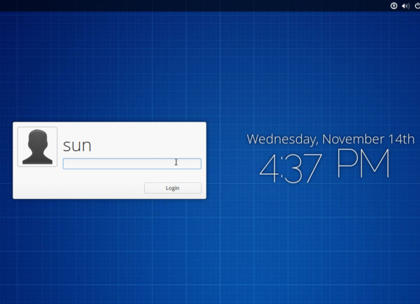
Pantheon Greeter, the login screen, is built atop LightDM.

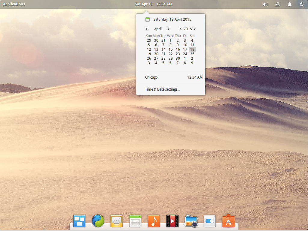
The default desktop. The (top) panel is called WingPanel. The dock is based on Plank.

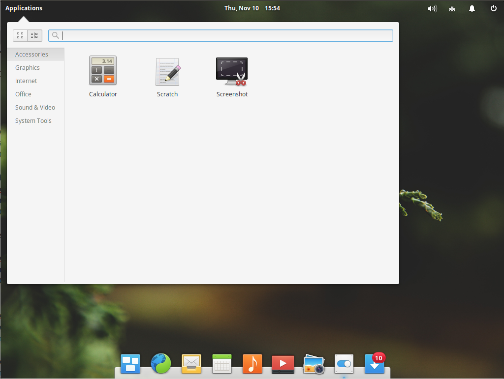
The applications menu is Slingshot.

The second page of Slingshot.

The desktop showing the online activity indicator on WingPanel.

On the applications side, Geary is the email client. This is the settings window.

Maya is the built-in calendar application. Setting up events is easy.

Maya is exportable to a file. More than any other, Maya is an application that I really need. I have an online calendar that I use, but it’d be nice to have one on my desktop.

Noise is the name of the music player. Never really played anything with it, but sooner than later, I will.

The text editor is Scratch.

Scratch has a built-in terminal, just like Dolphin, KDE’s file manager.

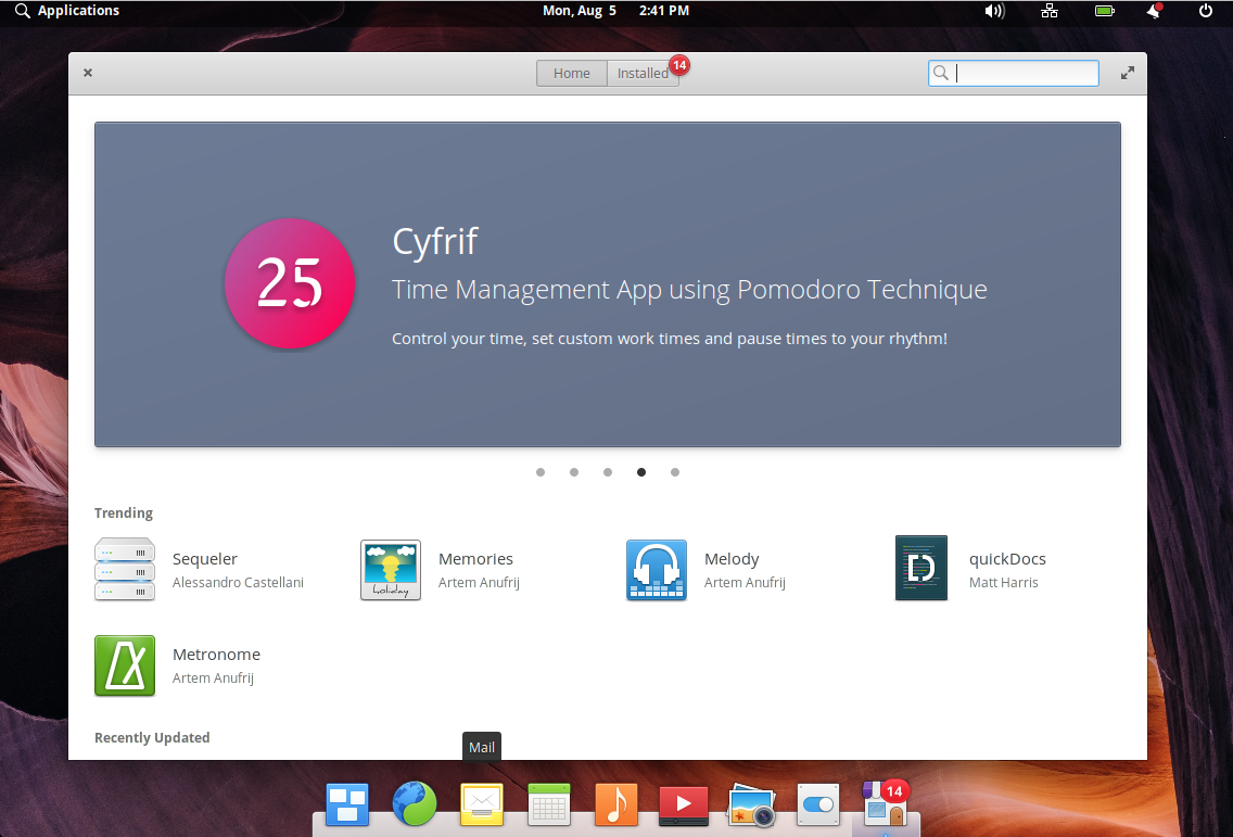
The graphical package should be very familiar, right?

What I especially like about the whole desktop is that every aspect is clean, uncluttered and very intuitive to use. This is definitely one distribution to keep an eye on. I think the final, stable edition should be released sometime next year, early next year. Download links for 32-bit and 64-bit version of Elementary OS Luna beta are available at the bottom of this page.


From now on – I”m steering clear of community based linux. They’re always so ruff and buggy. Call Me Whiny – but I can’t warm up to Unity. Elementary looks so dummed down and like a colorforms operating system. What are we 13 years old. I like clean and efficient. I don’t want menu bars that are 45 items long – I like the docky thing as a launcher. Just type a few letters and up comes a list of what you want. I’m still missing Gnome 2.
Want a professional desktop, try ROSA Desktop. The end-user edition should be out soon.
I should have added that I *really* like Elementary’s application menu; it’s clean, neat, well laid-out, and really improves the classic menu concept rather than attempting to eliminate it.
I actually like the version that shipped with Pear Linux better. See Pear Linux 6 review.
The top bar is a serious waste of space, and has very little function embedded in it. Some other desktop UIs use the top bar for task switching, but Elementary doesn’t do this. So, it needs to find another way to switch tasks and desktops; for this it has adopted OSX’s “hot corners” approach. So, the user has three separate controls to master (dock at the bottom, bar at the top, hot corners). Why the fragmentation?
Wouldn’t it be simpler to remove the top bar altogether, and transfer its minimal functionality into the bottom dock? Keep the hot corners if you like, although switching desktops that way is fine once or twice, but becomes annoying if you need to switch 100 times a day – it means zooming the mouse to a corner, then moving it to the desktop icon in the middle of the screen, then watching the animation as the desktop changes. It’s all quite busy, and not really very minimalist.
Do we really need large thumbnails of each open window? Aren’t small program icons enough? A much more concise (elementary?) arrangement has 1) an autohiding dock at the bottom, incorporating the “applications” menu and other little notifiers that Elementary currently has at the top, and 2) an autohiding panel (tint2 works really well for this) at the top, with separate panels representing each desktop, and showing program icons to represent apps running in each desktop.
Any good desktop UI can be reorganized like this, without the need to use 500MB of memory while idling, as Elementary does. My Xfce installation works this way, uses much less memory, and still keeps the customization options that Elementary has taken away (but that’s another conversation).
They should of used Deepin Software Center
Agreed. They should have used a better installer too.
I don’t know why but the Deepin Software Center, sometimes got some weird problems that I try to use Synaptic instead for my stuff.
The recent version of DSC that shipped with Pear 6 fixed some of those issues, but the most annoying one has not been fixed, which is, upgrading apps means clicking on the Upgrade button for each app that has an upgrade.
The reason they dont use Deepin Software Center (I asked them) is that it is not a Gtk application. They want all their default applicatiopns to be Gtk based
That’s strange! If DSC is not Gtk-based, then what is it?
im not sure…but I think it’s Qt