It is no secret that I do not like the default GNOME 3 desktop, not because everything about it is bad, but because the default setting does to rhyme with how I interact with my desktop or how I like to interact with my desktop.
Consequently, I have not even bothered to install a distribution running GNOME 3 in its default state on a “production” boxen, other than for review purposes only. But while preparing a review of Mageia 2 (should be published today), I came across an extension that could just make me a believer and user of GNOME 3.
The extension is called Panel-Docklet by a coder who goes by the name Jodli. The extension is at version 13. This tutorial shows how I installed and modified its default settings to suit my needs. Installing it involves the same process as installing any other GNOME 3 extension.
That means visiting https://extensions.gnome.org/. At the time of writing this tutorial, the extension is on the first page of the list of extensions on that website. Flip the switch to left of the screen to install it (you will be prompted to authenticate). When installed, the switch should change from OFF to ON.

After successful installation, you should see the Settings window, with the Welcome tab in focus. Closing the window without modifying any setting will give you a default Panel-Docklet located in the (top) panel.

Right-clicking on the box (the extension’s icon) will show a menu containing all the application icons on the default GNOME 3 desktop dock. Which just means that t is no longer necessary to access the default dock. But I did not like the new extension’s position, so I selected Settings.

And clicked on the Box – placing tab. From the Screen-position menu, I selected Bottom, and enabled Box size depends on number of icons.

Now, the extension sits at the bottom of the desktop. In other words, the desktop now has a top and a bottom panel. But I want it to occupy the entire length of the bottom edge, so I opened Settings again.

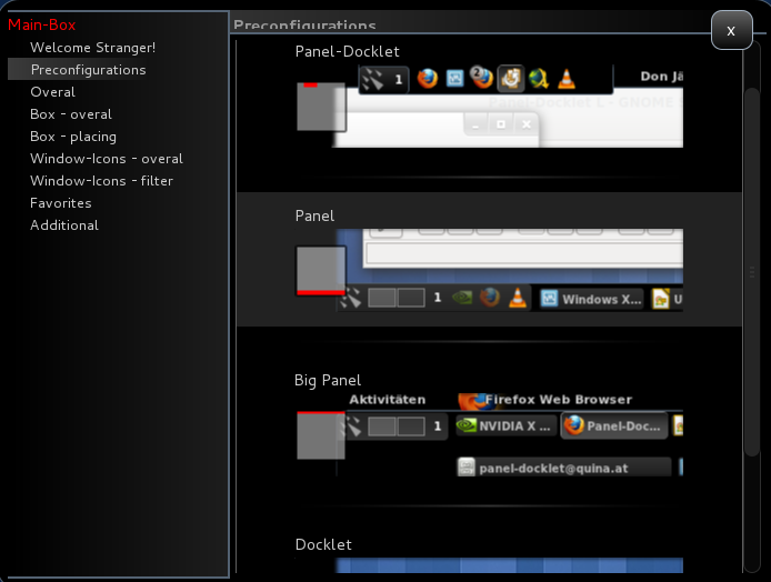
And clicked on the Preconfigurations tab. The Panel option gives me the look I want.

Right-clicking on an application’s icon on the panel opens a context menu, From there, I can open a new window of the application, pin it to the Favorites, and a few other options.

Right-clicking on the Box, the extension’s icon still gives me access to the icons on the default dock (Favirotes). Hope you like it as much as I do.





I use shell osd named extension,it just turns notifications from bottom to right corner.
https://extensions.gnome.org/extension/243/shell-osd/
Wow, this is great, I love it. Thank you very much for sharing this.
Seems interesting.
Let me ask you how does it interact (or interfere 😛 ?) with the notification bar that pop-ups if you place this Panel-Doclet on the bottom of the screen?
Notifications show up atop the panel. There is no interference.
I personally am fine with the default GNOME 3 desktop, but not a week goes by, it seems, where some former naysayer isn’t won back to GNOME because of an extension. Looks like GNOME 3’s focus on making it easy to extend the desktop was the right idea all along.
Now, if only the Linux Mint people would stop their dumb fork of GNOME 3, spend 10 minutes uploading their extensions to extensions.gnome.org, and spend their time on much-needed bug fixing in their Ubuntu spin.
Billy I agree with you. I think what Mint is doing is duplicating work that has been done already!