GNOME 3.4 was released yesterday and a Live demo ISO CD was made available shortly after. According to the Release Notes, it comes with some very cool features and the usual bugfixes. While I wondered, based on the Release Notes, whether the new features will make you a fan in this article, the Live demo CD gave me an opportunity to take the new system for a test drive – for a firsthand experience.
At first glance, the developers have not really changed the default look of the desktop at all. While that is still annoying, some of the new features and some enhancements to existing applications are impressive.
So, whether the new features will make you a fan or not will depend on what distribution you will be using. If your distribution is one that ships with the default GNOME 3.4 desktop, then you likely be disappointed. However, if you will be using a distribution like Deepin Linux and Comice OS 4, two distributions that ship with a heavily modified GNOME 3 desktop, then you will most likely have a positive opinion of the desktop. I am especially interested in what the Deepin Linux release will be like, because that is one distribution that is striking in the right direction.
While await the first distribution to ship with the new GNOME 3, here are screen shots from a test system running the Live demo CD.
A few existing applications were renamed. One of them, is the GNOME Disk Utility, which was renamed to Disks. The main interface is shown below. Until I can use it to mess with disk and disk partitions on a real system, there is very little I can write about it. If you are new to Linux, this is the application that you use to manage disks on a GNOME desktop.

And this is Contacts, the contact manager. By clicking on the appropriate button in the right section, you can initiate communication with a contact via email, chat or phone. Really nice!

Those screen shots are two example of applications that have been tweaked in GNOME 3.4. Another one is Epiphany, the Web browser, which was renamed to Web. Despite the enhancements which it was supposed to have received, I could never get it to stop crashing, which it did every time I tried to use it. It definitely needs more attention from the developers.
Two other features that I really like, are the built-in screen recorder and Boxes, an application that makes it easy to run other operating systems on your GNOME 3.4 system. Sort of like a built-in OS virtualization tool. Boxes and the screen recorder deserve a dedicated article, so look out for them latest tomorrow.
The rest of the screen shot shows what has not changed. This is the default desktop. If there is one thing I dislike, it is the default GNOME 3 desktop. The developers obviously have turned a deaf ear to the community of users.

The same desktop showing the calendar.

Activities view showing the Dock and the virtual workspace panel.

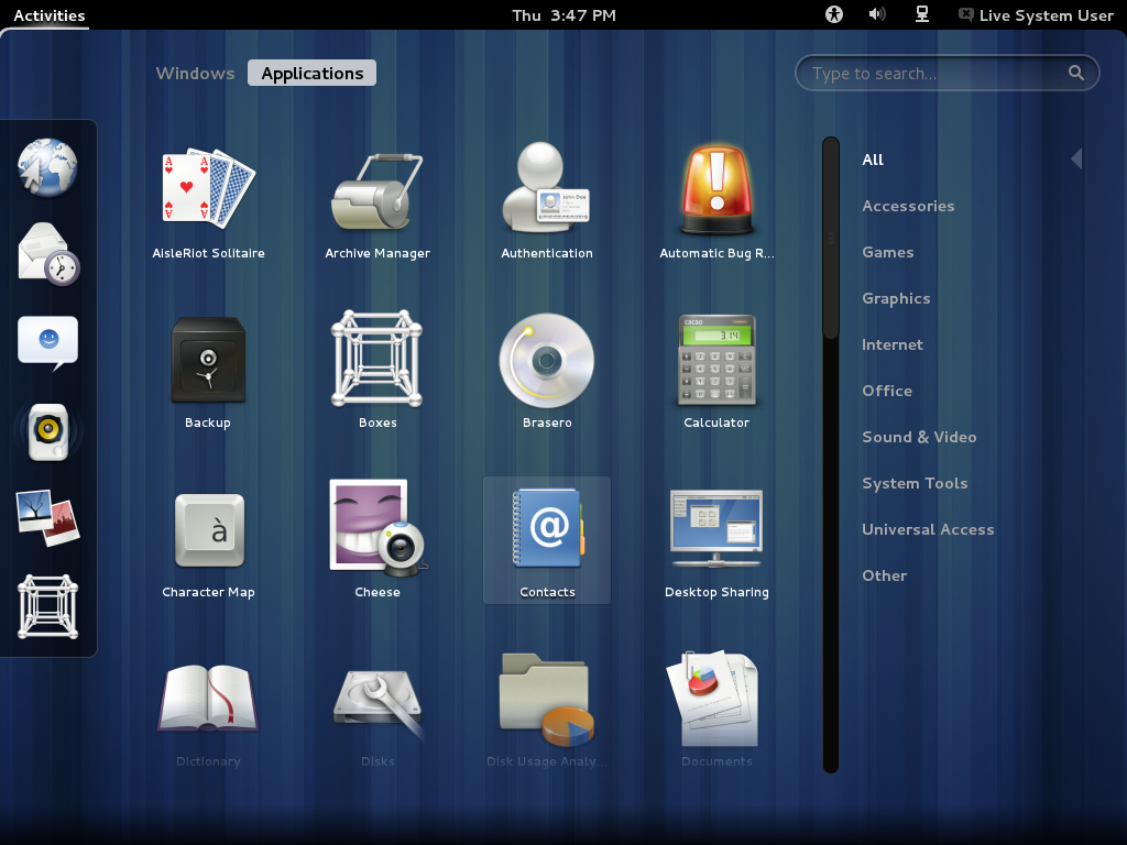
Activities view showing just the Dock. Boxes is a default item on the Dock. You will be reading a lot about Boxes because I think it is a very cool tool. Whether it will work as advertised is another matter.

This is actually the desktop showing Totem playing the WebM video I made of the system using the built-in screen recorder. Unfortunately, the system froze, likely as a result of trying to get too many tasks going on at the same time. The built-in screen recorder worked quite well.

This is a screen shot of the Disk Usage Analyzer, showing information about the local file system.

From the same application, you can connect to a remote host and view disk usage information.

A view of the applications menu, showing some installed applications.


boxes is new thing.