Kubuntu is a community-developed, desktop Linux distribution sponsored by Canonical Ltd, the same company behind Ubuntu. The latest stable release, Kubuntu 11.04, code-named Natty Narwhal, was released on April 28, 2011. This article presents a detailed review of this KDE-based Linux distribution.
Installer and Installation Process: To install Kubuntu on a 32- or 64-bit computer, you either download a CD or DVD ISO image. A CD image allows you to install (Kubuntu) using a graphical interface, while a DVD image offers the option of the same graphical interface available on the CD image or an ncurses-based interface. There is also a CD installation image that uses just the ncurses installer. This image is the boot menu options from a DVD image.

Graphical Installer The graphical installer offers the same steps for installation that are on the Ubuntu installer. They are essentially the same.

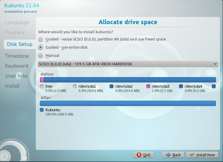
There are automated disk partitioning options as well as a manual option, for those times when you want to create a custom set of partitions. There is no support for LVM, the Linux Logical Volume Manager, and software RAID. Full disk encryption is also not supported, but the installer offers an option to encrypt your home directory. Note that by default, the home directory is not on a separate partition because only two partitions – for /, the root directory, and Swap – are created by the installer. So encrypting your home directory does not offer the same benefits as full disk encryption.

Alternate Installer – This installer supports LVM, encrypted LVM, software RAID and (full) disk encryption. If you have installed Debian, you will feel right at home using this installer. Though LVM is supported, it is not the default. When automated LVM is used, the installer creates a non-LVM partition for /boot plus two logical volumes – for /, the root directory, and Swap. Like the graphical installer, it also offers the option to encrypt your home directory, whether you opt for LVM or the classic partitioning scheme.

If you opt to use LVM, the installer gives you the option to specify what percentage of the disk you want to use. This is important because when setting up LVM, it is not necessary to use all available disk space, just the minimum needed to get the system installed. The unused space left in the Volume Group is supposed to be used for creating additional logical volumes, if needed, or to grow existing logical volumes, if they run out of space.

On either installer, ext4 is the default file system, with ext3, xfs, jfs, and reiserfs also supported. When using LVM, ext2 is the default file system for the /boot partition. Btrfs, the B-Tree File System, is supported, but there are known issues with it on Natty, so evaluate the issues before you install it on a btrfs file system. While previous editions of Kubuntu required less than 3 GB of disk space to install, this edition now recommends a minimum of 3.8 GB (of disk space). On a new installation, only about 2.7 GB of the space allocated is used.
Desktop: Kubuntu ships with KDE 4.6.2. The latest stable edition, released just today (May 6, 2011), is KDE 4.6.3. Like most other KDE-based distributions, the default menu style is the Kickoff style.

One of the newest features on KDE is easy access to the folders in your home directory.

Aside from the traditional desktop interface, KDE also offers the Plasma Netbook interface, one of several such (desktop) interfaces designed for use on small screens. Though these interfaces are designed for small screens, they work just as well on desktop and standard notebook computers. One of them, the Unity interface, is now the default desktop interface on Ubuntu, beginning with Ubuntu 11.04. You may view more screenshots of the Plasma Netbook interface here.




A very fast and stable alternative for kubuntu is opensuse 11.4 (KDE edition). Special highlights are a powerfull configuration utility called “Yast” and very well-kept software repositories. I’ve been using Ubuntu-based distributions for severals years, but opensuse 11.4 convinced me to turn away from the *buntu-universe. Until now i haven’t regret it.
No way. I’ve been a SuSEr some years ago.
Debian line (and this includes Ubuntu) seems to me far better than un-standard SuSE’s ways.
Yast is fine, but only if you want not to think and want an “administrator” to administrate your system.
I’ve tested every openSuSe version since 10.2 and I have to admit that I didn’t like the distro so far. But the recently released 11.4 changed everything for me. It works almost perfectly on my machine and offers various benefits I’ve been missing so far. Of course there are some differences in comparison to Ubuntu which SuSe-newbies have to learn but I think it’s worth the effort. To be honestly I’m not sure I understand what is meant with “un-standard SuSE’s ways” in the comment above.
I demand a normal desktop.
It gives the freedom a computer-user needs I think.
Or is that asked too much?
So can unity or something like Gnome3 be switched off? I hope so…
If your hardware cannot run Unity, you get the option to run the old GNOME 2 desktop. In the future, there will be nothing but Unity. GNOME 3 also has a Fallback mode.
Unmitigated fool,you must learn not to demand,please describe normal desktop ? Taken a five pound hammer
to your every PC.
Highly disappointed. Nothing great in this review.
What would constitute a “great” review?
Well. Review is not just about playing with it for few hours and posting some screen shots. Have a look at this review on crunchbang linux 10 http://ldorsplace.wordpress.com/2011/04/18/it-doesnt-go-snap-crackle-pop-it-goes-crunchbang/ . Just see how the author approaches the distro.
true? most reviews are like that. i remember dan lynch had nice ones, he used each distro a week or two (i think he was distrohopping about a year). customizing it to his needs and then sharing his experience.
or chema martin, whose pain on opensuse+skype i can relate to.
however most like finid or dedoimedo have their check list (security!, installation, multimedia, samba..etc) and make a run through. this is not completely useless as often they focus on different things. and still different hardware, different experiences. however, there are some superficial virtual box screenshot runthroughs, which are more like viral marketing (for the ads on the blog) and sparse on info.
to give credit i hope i am allowed to post links to
an older review by dan: http://danlynch.org/
chema martin http://cristalinux.blogspot.com/
thanks for all your time and work.
FYI, a bunch of links in a comment will always drop the comment into the spam bin.
To your comment:
Reviews can be tricky. They tend to reflect stuff the reviewer thinks are worth writing about. As a reader, your take on the review will also reflect what is important to you. Screenshots tend to help the story along. Some readers get more info from a good screenshot than they will from several paragraphs of texts. I try to give a mix of both, but there is always room for improvement. There is this saying about a picture being worth more than a zillion words.
My position on reviews is this: They should be mostly about the experience of the reviewer with the default installation of the distro. In other words, I try to convey what you will experience if you decide to download and install the distro. That’s what I think a review should be mostly about.
Telling you how I customized it and how it behaved after I customized it is the stuff that tutorials are made of. So this site is mostly a mix of reviews and tutorials. Some reviews are good, some are bad. That’s life. Most times, my girl tells me I deserve a gold medal. Other times, she tells me I should have waited for her (never mind that we started at the same time 😉 ).
In any case, your points are well taken. Like I said, there is always room for improvement. Hopefully, you will find the next review more to your taste.
While I am very impressed with Kubuntu 11.04 I keep wondering why Ubuntu, Xubuntu and Lubuntu customize the wallpaper and the start button icon while Kubuntu stays default KDE 4.
Maybe because Nuno and his team who do the graphics for KDE are very well respected in their field and do some really nice visual stuff.
But seriously, how many people stick with the default wallpaper
This is the kind of stuff that annoys me no end with distros like Buntu: people drool over trivial things to show how different they are when its all the same thing.
If a distro` selling point is its wallpaper and icons, then we have reached the point that we have to admit that all distros are the same (with same desktop) and that most newbies couldnt tell them apart.
I stopped giving people Live CDs a while back because people kept asking me why they were all the same (i offer now only from different desktops).
good point: the kde default art is nice enough and should be appreciated somewhere. plus, it´s very easy to customize from the desktop settings within (if that does not make sense, go to system settings ans you will be able to download themes, icons etc. without having to go to a webpage, download, extract….).
like i said i am VERY content with kubuntu 11.04. i love it.
“One of the newest features on KDE is easy access to the folders in your home directory.” Do you mean the quickaccess widget sitting right by the menu button in the panel? You never have used Kubuntu before I guess? The quickaccess widget is used in Kubuntu since the first release with KDE4. Alas it is not an official part of the KDE desktop.
I’m extremely impressed with Kubuntu. Until 11.04 I’ve been Ubuntu user but they screwed it with Unity. Many suggested that Kubuntu is better so I also tried it and wow, I was blown away. I like it Kubuntu (and KDE) so much now I’m kind of sorry I didn’t try it earlier. Now I only have to see other KDE Linux distributions to see if any is even better. Maybe Chakra as you suggest will be the first I try next.