You can always find a reason or two to like or not like something, and frequently, the reason you like one thing is exactly why the next guy does not. I used to be a fan of the K Desktop Environment (KDE). I said “used to” because I could not make the transition from KDE 3.5 to KDE 4. At that time, there were too many issues with KDE 4 that I decided to look elsewhere.
But KDE 4 matured. It is still dogged by the performance issues that I do not think will ever go away, but things are much better than they used to be, and with the mess that GNOME 3 and the Unity Desktop bring to the Linux desktop, I am beginning to look for greener pastures.
But where else can I look if not to KDE? LXDE and Xfce are good, but they lack that modern, 21st Century desktop look that appeals to me. To me, the difference between KDE 4 and LXDE and Xfce is like that between a smart phone and a feature phone. But looks aside, I want a desktop that does not get in my way, one that makes it easy to get to stuff I need in a user-friendly manner. In the Stackfolder and the Takeoff Launcher, I think I have found two very cool reasons to embrace KDE 4. Takeoff Launcher is still missing a few pieces, but for me, they are not show-stoppers. Let’s see how these cool features look on a recently reviewed distribution.
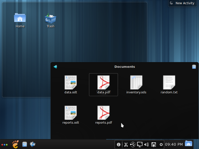
Let me start with the Stackfolder. It is a very simple widget that you place on the panel. It makes it possible to access files and folders in your home directory without launching Dolphin, the file manager. This screenshot shows the home directory view. You can drill down into a directory to access its files.

This is a view of files in a directory. With the navigational arrow on the top left, you can return to the previous view, and if you want to open Dolphin, click on the icon in the top right. It is really nice.

Now to Takeoff Launcher. It is just another menu style for KDE, and much better than the Kickoff menu, the Lancelot and, of course, the Classic menu. The screenshot below is a view of the All Applications category. By default, the launcher opens in fullscreen mode, with application icons arranged in five columns and three rows. A list of application categories occupy a scrollable strip in the upper section, and a numbered navigation bar in the lower section allows you to access “overflow” items from the same category. There is a Favorites tab, which is empty by default. You can populate it with application icons simply by right-clicking on an icon and selecting the only option – “Add to favorites.”

Almost every aspect of Takeoff Launcher is configurable. This screenshot shows some default settings. If you feel that the spacing between icons is too wide, you can adjust it here. Don’t like it opening in fullscreen mode? You can adjust that too.

This view is of the Favorites tab after it has been populated with my favorite applications. To remove an item, just right-click on it and select the only option – “Remove from favorites.”

This last screenshot shows items in the All Applications category after the number of columns has been changed to four. the default is five.

All the screenshots in this article were taken from a test installation of Chakra Edn 2011.11, a distribution that was just reviewed here. Takeoff Launcher should be in your distribution’s repository. If not, you may download it from here. Stackfolder should be available as a widget. Instructions on how to add them to the panel are available here.






And my reasons to use KDE is:
i like futuristic technology
i like glossy iconset
i like translucent-elegant desktop
i like dolphin more than nautilus
i like beautiful desktop
i like compizable desktop
Until I make my new blog about ideas for Linux future 🙂
jhon, that’t the neda theme that comes standard in Chakra.
hi, what plasma theme are you using in the screens?