The K Desktop Environment (KDE) has more menu styles than any other desktop environment available. There is the Classical type, the Kickoff style (which most users dislike), Lancelot (better than Kickoff, but with a few shortcomings), the ROSA Launcher (for Mandriva Desktop 2011), and the Takeoff Launcher.
I have already written about the Lancelot menu and the ROSA Launcher. In this article, you will get to see screenshots of Takeoff Launcher. Now that I have used all five menu styles, I can say with confidence that the Takeoff Launcher is best of breed. I think it is what Mandriva developers had in mind when they started working on ROSA Launcher.
The screenshots used for this article where all taken from a test installation of Chakra Edn 2011.11, the latest release of the semi-rolling desktop Linux distribution. A review of that release will be published here tomorrow. (Update: Read the review here.) Takeoff Launcher is not the default menu style in Chakra, so it must be installed using the package manager. Like ROSA Launcher, Takeoff Launcher has a tabbed interface, with a columnar arrangement of application icons. When you first clicked on it, all you get is an empty Favorites tab, taken up the entire desktop. The application categories sit atop the top section in a narrow, scrollable strip.

This is a view of the All Applications category. By default, application icons are arranged in five columns and three rows. This screenshot, by the way, was taken from a system using a 1024×768 screen resolution. To add an item to the Favorites tab, right-lick on it and select the only option – “Add to favorites.”

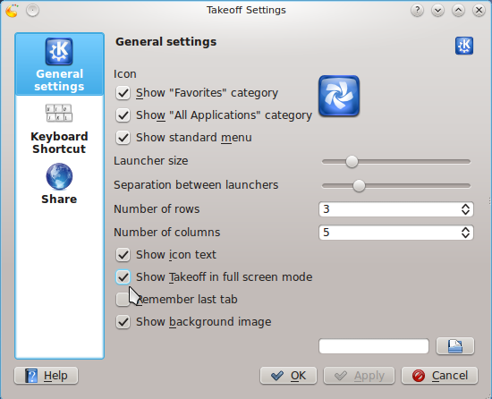
Unlike the ROSA Launcher, Takeoff Launcher is configurable. This screenshot shows the default settings. Almost every aspect of the launcher can be adjusted. If you feel that the spacing between icons is too wide, you can adjust it here.

Here is what it looks like in non-fullscreen mode, with just the Favorites and All Applications categories enabled.

And this is what happens when you add an additional row and column in 1024×768 screen resolution. Exactly what happens to the ROSA Launcher. There is really no need to change the default number of columns at that screen resolution.

This is my preferred setup. It is a lot better and lot easier to access applications if all application categories are enabled.

And the Favorites tab is populated with my favorite applications. To remove an item, just right-click on it and select the only option – “Remove from favorites.”


I tried to add it like any other widget but it’s not available in the widgets area.
How can you enable Takeoff once it’s installed? Hotkey? Voodoo science? Help?
Once it is installed, you add it to the panel just like any other widget. Click on the panel and select Panel Options > Add Widget. In the search box, typing “take” or “takeoff” should show the icon for the widget.
Double click on it to add it to the panel. That is it. For screen shots, see how to install Takeoff Launcher on Fedora 16 KDE and How to compile and install Takeoff Launcher on Linux Mint 12 KDE.
I don’t like to scroll sideways. Is there a way to scroll vertically through the app.list+
It’s really not scrolling, but sliding. All you need to do is click on the numbered tab, and it slides to reveal the next batch of apps.
That is much slower than scrolling. I’d rather prefer to scroll. Maybe add that as an option? I wont use this launcher before that is impossible. This menu probably works great for tablets.
Impossible =possible
Impossible is nothing.
Hi,
Where can I download the KDE Takeoff launcher from?
And How can I install it on fedora 16?
Thanks
You may download it from http://code.google.com/p/takeoff-launcher/wiki/Downloads?tm=2.
There is a repo on that page for Fedora 15, not for 16, so I do not know if that will work for you. Since there is no official Fedora 16 package, I will try and write a tutorial on how to compile it from source.
Hi,
It is working on Fedora 16.
Thanks a lot.
Quite interesting.
Though, I don’t like an idea to move mouse from bottom-down to top-middle to switch between categories. Can they be moved to the bottom?
No, that is not configurable.
That’s pity.
Offtopic: your video ad is too annoying. especially when it starts talking out of the blue. will you be able to disable it?
It annoys the heck out of me too, but right now, it pays most of the bills. I am actively looking for an alternative, and as soon as I find another provider, I’ll dump the tag.
For a desktop, I like the default Kickoff menu just fine. I just type the name and the application shows up. I can see where this menu system would be better for touchscreens though.
That is 5 Menus … Gnome has 6, so how does KDE have more menus than any other?
Please do some research next time
What, then, are the 6 for GNOME?