Muon Package Management Suite is the package management application that will replace Kubuntu’s package manager when Kubuntu 11.10 is released next month. It is designed for Debian-based systems, so it could be used on similar distributions, not just on Kubuntu. In fact, it is included in the default repository of Linux Mint 11. Its development is by Jonathan Thomas.
It is made up of three graphical applications – Muon Package Manager, Muon Software Center, and Muon Updater. Most package management systems have a pair of graphical interfaces – the main application for installing and removing applications, and a package updates interface. So, why does Muon split package management responsibilities into three graphical interfaces? To paraphrase the author, Muon Package Manager is for system administrators (geeks, that is), while Muon Software Center is for the rest who do not want to be bothered with the geeky side of package management. Muon Updater is, of course, for upgrading applications.
As I examine the features of Muon Package Manager, there is nothing I see that could scare even the most inexperienced users, and certainly, no feature that is not present in other graphical package management programs that we are not already familiar with from other distributions. So, as I see it, Muon Package Manager is completely unnecessary, especially on a system where the default user is also the system administrator. There are schemes built into user management applications in Linux that limits who enjoys the privilege of managing applications on a system, so the idea of a separate interface for system administrators does not make sense.
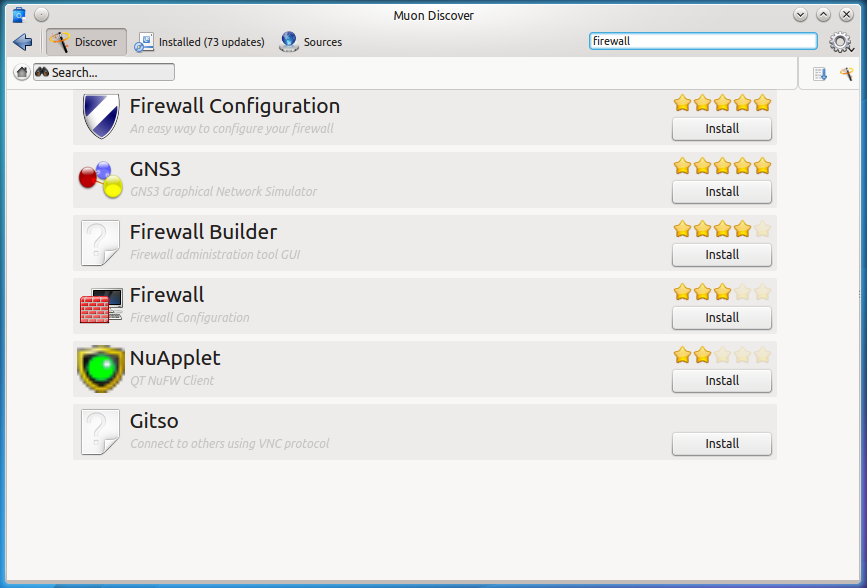
Now that you know what I think about Muon Package Management Suite, here are a few screenshots to show the features of the three graphical interfaces that make up the suite.
The main view of Muon Software Center, It is similar to the Software Center of Ubuntu and the Software Manager of Linux Mint, but lacks the flashy graphics of either.

And the applications listing view. Notice that it has a history feature that when clicked, will reveal all software management activities, by day, on the system.

The single application view, with application thumbnail and ratings.

And this is the main interface of Muon Package Manager. As stated earlier, its features could have been integrated into the Muon Software Center. I also think that the list of categories in the side bar is too granular. It makes it look very untidy or cluttered. Unlike the Muon Software Center, you can queue multiple applications for installation.

This is another view of Muon Package Manager.

Yet another view of Muon Package Manager showing a list of available updates.

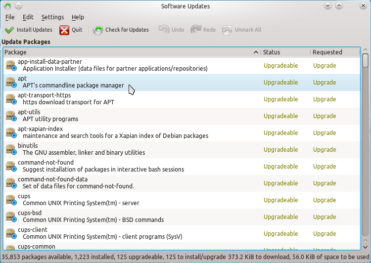
Finally, this is a view of Muon Updater, which may be started from the command line with the muon-updater command.




I find Muon Package Manager useful, intuitive, powerful and well integrated in Kubuntu (a better substitute for the old and intricate Kpackagekit). I have tried Synaptic on Kubuntu 11.10 too, and it is not so user-friendly (packages for i386 are mixed with the amd64 ones). Muon Software Center is for newbies and I don’t like very much. Overall the package management on Kubuntu 11.10 is very improved. I hope Kubuntu becomes a daughter of Canonical, and no more a simple stepdaughter. I think the moment is next.
Didn’t ever got any idea of graphic package managers. Aptitude does the job pretty well.
The distinction of for system administrators vs. for the rest isn’t simply a matter of user permissions. Yes by default the user of an Ubuntu system has system administrator permissions, but they aren’t necessarily a system administrator by trade.
The reason for the distinction is that most (lay/non-geek/non-technical) users don’t care for the features set provided by the package manager, they want to install firefox or remove gimp. For most simple operations you pull up Software Center and perform the task. Package Manager exists as the do-everything management application that’s used by someone with more technical expertise so that they can install the build dependencies of an application they are developing, or what have you.
Yes they could be merged, but can you do so in such a way that preserves the simpleness of performing basic operations by non-technical users while at the same time preserving the rich feature-set expected by the technical users? To the Muon developers, apparently the answer is no so they kept them split.
Doenst look that much different (if you told me this was the newest kpackeagekit I would have thought sure) dont think it will be a problem
I like the green installed as opposed to teh check mark system now.
They seem to use the same green icon thats in use now.
Will that remain the same for the system tray?
Having used (or tried to) Muon in Linux Mint, I found it a pita – I much prefer Synaptic – simpler & effective – I’m sure most ‘ordinary’ users prefer its simplicity!