GNOME 3, KDE, LXDE and E17 are four complete desktop environments available during the installation of Mageia 2, the latest release of the Linux distribution derived from Mandriva.
While KDE is usable without modification for the vast majority of users, the other three require that most users get some digital grease on their hands before getting real comfy using them.
From my perspective, the worst culprit is GNOME 3. And though I have often criticised the default GNOME 3 interface, with a little bit of tweaking here and there, I have been able to get it to a point where I can actually use it for my daily computing tasks. It is not perfect, but much better than the default configuration. The idea is to make it look like a standard desktop that lends itself very well to using the mouse, rather than mostly to keyboard shortcuts. For me, that means getting the titlebar buttons back and also getting a sane and usable task manager or panel on the desktop.
In this short article, I will show you how to get those two features. The first requires the installation of a package called gnome-tweak-tool. You may install it from the command line or by using the graphical package manager. To get the second feature involves the installation of an extension.
The gnome-tweak-tool. From the command line, type, as root, urpmi gnome-tweak-tool. Using the graphical package manager, typing tweak in the search box should bring up the application. Select it, then click Apply to install it. The instruction here assumes that you know what a command line and how to access it, and how to access the graphical package manager.

To access gnome-tweak-tool, press the Super key on the keyboard (it is the key with the Windows logo, between the left Ctrl and Alt keys. Typing the first few letters of Advanced should bring up an icon named Advanced Settings. Start it.

This is what it looks like. Click on the Shell tab, then select All from the Arrangement of buttons on the titlebar menu. You can see the result of this operation in the top-right corner of this screen shot. Those are the titlebar buttons. Out of the box, only the close button is enabled.

Before closing the window, you might also want to make another change. From the Windows tab, select Toggle Shade from the Action on title bar double-click menu. What this does, is to shade or roll up a window when you double-click on the titlebar. It just gives you one more window management option.

With the first feature enabled, time to take care of the second. Since I have written about that in another article, I will just point you to the article that shows how to enable it. You may read it at Panel-Docklet: A must-install extension for GNOME 3.
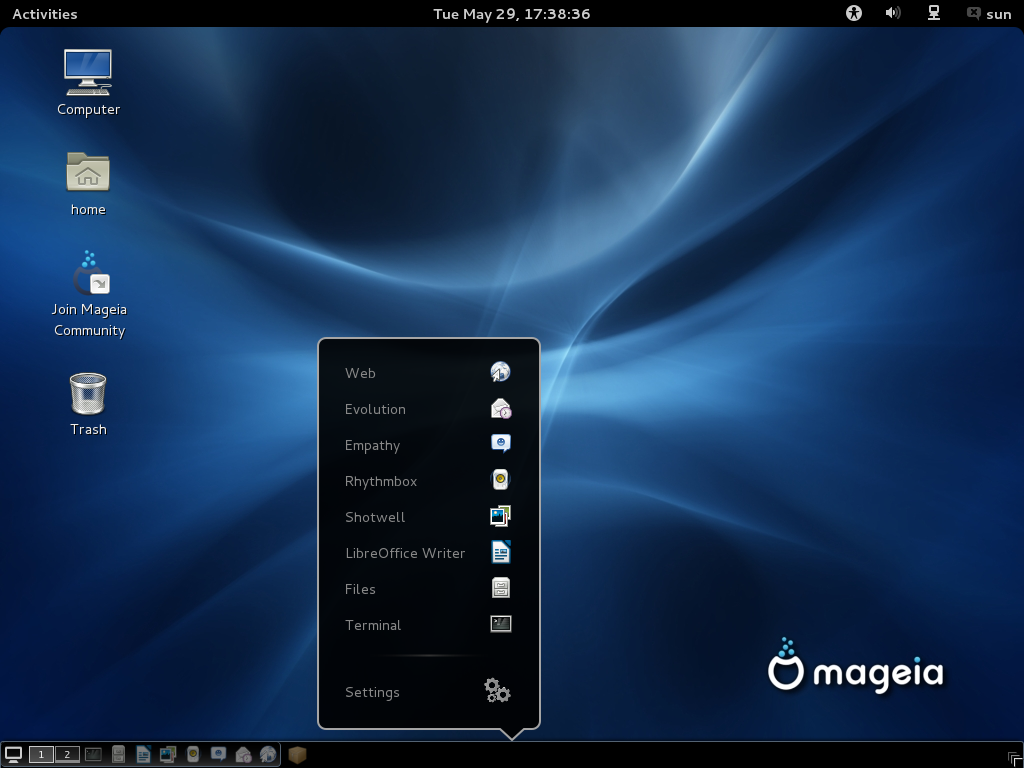
After installing and messing with the extension, your GNOME 3 desktop on Mageia 2 should look just like the one in this screen shot.




If he would like Mandriva and KDE so he had wrote what other. He likes Mageia 2 and a desktop who is similar to GNOME 2 like possible. Mandriva 2011 was not Mandriva but a ROSA because the Russiand has have the money and the command. I wanna really hope that Mandriva 2012 (what seems to be a Mandriva 2013 in reality) will be a real Mandriva again! Your ROSA Marathon is a Kindergarten desktop…
>How to get back that friendly desktop look on Mageia
Simple, use KDE.
I dont mean to be glib but Mandriva has always been known as THE KDE desktop of reference and while Im sure its Gnome is as good/bad as others versions (the differences between distros are cosmetic and almost non-existent), it seems like counter intuitive.
If you like Mandriva and KDE, you should give ROSA a try. More at ROSA Marathon 2012 review.