Fullscreen application menus or launchers (or whatever else you what to call them) are modern replacements for the traditional or classic application menus. If you use a GNOME 3 desktop with the GNOME Shell in its default configuration, its App View is an example of a fullscreen application launcher.
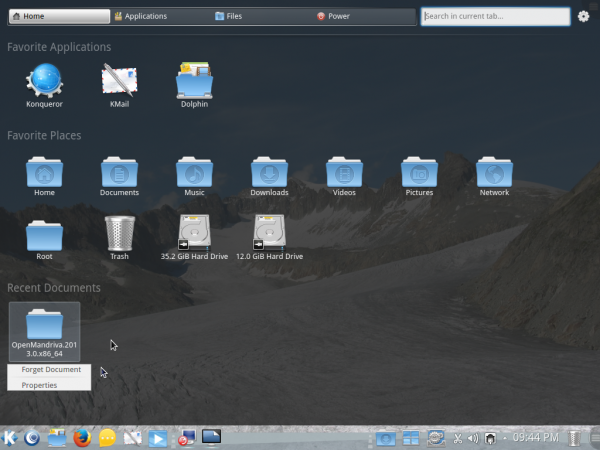
The KDE desktop environment also has its own fullscreen application launchers, but most KDE desktops still ship with the Kickoff menu by default. Two such menus for KDE that I am aware of are Homerun and SimpleWelcome. The latter is the default app launcher on ROSA Desktop and OpenMandriva LX 2013.0.
Though Homerun is not the default on any distribution’s KDE edition, it is, by my assessment, better than SimpleWelcome. The following screen shots show what it looks like and why I think it is better than SimpleWelcome.
This screen shot shows Homerun’s default home page. Out of the box, there are four tabs, and each tab has one or more sources. In this screen shot, Favorite Applications, Favorite Places, and Recent Documents are examples of sources.

On the Applications tab, you can view installed applications all at once, with a vertical scroll.

Or if you like, view them by categories. This is not possible with SimpleWelcome.

The Files tab offers access to directories in your home folder.

While the Power tab gives you access to shutdown and session control options. On SimpleWelcome, the Suspend and Hibernate options are not available.

Virtually every aspect of Homerun is configurable. This screen shot shows how you access its configuration tool.

The position of the tabs cannot only be swapped, but you can also give each tab a custom name. And you can also add a new tab or delete an existing one. You can’t do these things on SimpleWelcome. This screen shot shows the same default view as the first image in this article. Notice that the names of three of the tabs have changed.

You have free control over what sources are available on each tab. And because everything is widgetized, you can drag and drop all you want.

From the Files tab, or even from the Favorite Places source of the Home page, you can browse the contents of a directory or folder without opening Dolphin, the file manager. Not possible with SimpleWelcome.

What I’ll like to see implemented in Homerun, is KLook integration, which will make it possible to read the contents of a file just by mousing over the file and clicking the Space bar on the keyboard. Or have an option in the context menu that says, “Read with KLook.” But that might not even be necessary as we can already do that with StackFolder and KLook as shown in this screen shot.

Right-clicking on Homerun’s icon on the panel gives you access to its settings window. The only features that can be configured there are: 1. Changing the icon; 2. Assign it a keyboard shortcut.

Here are two more screen shots from Homerun.
This one shows installed KDE games.

This, shows installed system management tools.




These days a screen full of icons and stuff is deemed modern. I however dislike what I see as visual pollution.
It is comforting that users still exercise choice.
Unrelated, I cannot see what I type without highlighting … most annoying.